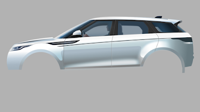
I was blown away when first seeing the Range Rover Evoque. Its design is stunning. Perfect in every detail. The designer obviously is brilliant and the fact that the car turned out so beautiful is probably the result of the marketing department not getting in the way. These blokes often are responsible for ruining designs that are a caress to the eye, because they want to please as many (potential clients) as possible. But with a designer capable of creating such a mind-blowing car, Land Rover did well to keep its marketeers on a short leash.
 |
| Stage 20 - Dec 11 2019 - 22:11 CET with transparent background |
The drawing in wire-frame view looks quite simple; the bulk of the work is to get the gradient colours right and the gradient transparency. They could of course be eye-dropped from the reference photo, but like in my portraits of humans, I like to put more drama in the images I create by altering details in which colours are very important. Another 'problem' in Affinity Designer is to get gradient shadows and reflections right, i.e. when gradients extend in more than one direction. I usually duplicate such an object and change the colours and gradient direction of the duplicated layer (and / or consecutive layers). The unwanted parts I 'remove' by applying custom transparency or by altering the shape of the object (adding or subtracting parts of the object area). B.t.w. all objects are given a Gaussian blur to make the image more realistic. Objects drawn in CorelDRAW or Illustrator often look unrealistic, because of (the object's) hard edges. Artists won't have this problem in affinity Designer.
Drawing such a subject results in many layers. Each object is a separate layer that I gave a specific name in order to make finding a particular object in the layers panel less of a hassle. I lock the reference image on top of all layers and make it transparent, so that I can always choose to see the reference or not while not interfering with other layers. Mind you, you can make the semi transparent reference layer visible, while still being able to draw on a selected layer below it, which is brilliant. I also use the outline view a lot which I gave a custom shortcut to make it possible to quickly switch between normal view and outline view. When having created a bundle of objects it is often quite useful to select the object in outline view (wire-frame view).
A feature not yet included in Affinity Designer is the feather function which would have been quite helpful (and time saving) in creating this image. But I saw Serif put it on the road map of future functions to be added. Although I'm not overly enthusiastic about mesh-fill function (like in CorelDRAW and Illustrator), it may have been useful at some points during the drawing of this car, but again, I saw this on Designer's road map of future functions. Other than that, Affinity Designer allows me to do things very quickly and precisely that I was not able to do equally fast or precise in the programs of the aforementioned competition, which becomes clear in particular in the vector portraits that you find elsewhere on this blog.
I just had to make a drawing of this eye caressing creation. It is a 100% vector drawing made in Affinity Designer. I bundled the first 12 stages in one image to get past the boring level and placed some later stages above that. Click on one of the images to see the stages in Google's Lightbox in which you can scroll through the stages swiftly by turning the scroll wheel of the mouse (on a PC anyway). Oldest stage at the bottom, newer ones above that. I've also made a short clip of this sequence that you find here.
 |
| Stage 18 - Dec 10 2019 - 19:06 CET |
 |
| Outline view of stage 18 |
 |
| Stage 16 Dec 9 2019 |
 |
| First 12 stages |
Here is an experiment with the video editor 'Olive', my very first try, so bear with me. You may want to take a peek at this video in full screen mode.


