I am in a way struck when observing Celtic motives, which resulted in me creating this image. It probably has to do with impulses generated by my subconscious. There is symbolism hidden in the number of objects and values I assigned to colours, gradient colours, opacity levels and effects that obviously are visible only in the vector drawing that I created in Affinity Designer, as is usual for my 2D artwork. Affinity, by the way, has laid the foundation, from version 1.10.0.1127, that future updates will profit from; the rendering speed has significantly been increased, especially if you have a proper GPU (which I don't have). It makes it easier for artists to meet deadlines and consequently have time to gulp a few beers in the pub (provided government imposed scamdemic suppression does not prevent them from exercising their basic human rights).
It means that the program requires less time to render complex drawings that have more native and embedded objects (Layers). As Dave Conrey assumed in one of his latest Youtube video clips, that may be the fundament on which future functionality will be based. A sound approach if true and possibly an indication that Serif has carefully considered long term plans with its programs - Designer, Photo and Publisher. It would explain the relatively slow addition of functionality in the programs since the programs were issued roughly 5 or 6 years ago, because Serif's position is that it is not a good idea to build the second floor and third floor if the first floor is not properly constructed. Although such suspicions are of course conjecture, they certainly make sense, especially in view of the way in which 1.10.0 was announced, shortly before release.
Ok, since I am diving a little deeper into matters, I may also point at the fact that Serif - the company that created the Affinity suit - read backwards reads fires, fire being one of the elements of life. I am not going to expound on this in this blog entry, but fire, along with earth, water, air and space, is one of the basic elements of nature and therefore life. One of the things that can be done with the programs in the suit is to express thoughts, observations and events or as professor Frank Tipler in his book 'The Physics of Immortality' has claimed: Life is the exchange of information. This may seem far fetched to many, but when giving life a profoundly perceptive thought, conclusions often end up in a similar sequence of ideas, even in cases that at first glance seem unrelated.
Anyway, this Celtic logo, symbolizing the Tree of Life, is the underpinning of life as we know it and of life forms currently beyond our perception. I thought that this is a nice analogy with the way Serif operates. The fact that current life for the majority of humankind is not particularly a pleasant ride, is not a result of the fact that its foundation was not planned and conceived in a profound way, but rather the result of some entities (including derailed humans) having a perversely misguided and twisted mind that does not take into account universal law. Doing things right, as Serif does, is the way to go about things, in spite of the fact such an approach in this dimension of linear / cyclical time takes time. The reason that I include symbolism in my work is spurred by an alike mindset. If a picture paints a thousand words, a symbol paints a thousand pictures. Just so you know.
Below the rendered images you see the vector outline view, which shows there aren't any clipped objects this time, so this is a relatively simple image. Click on the rendered drawing to see a larger version of it in Google's Lightbox that also allows to flick through the images by using the scroll wheel of the mouse.
 |
| The Tree of Life as Celts may have imagined it |
 |
A slight colour change and darkening
|
 |
| A less 'burned' version of the drawing |
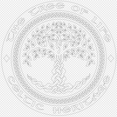 |
| Vector Outline View of the drawing |


