Showing posts with label test. Show all posts

October 23, 2022

Exploring VectorStyler - Part II


Introduction
After losing the files I saved on a network drive in VectorStyler, as stated in the previous blog entry, I decided to save them on the system drive, which in itself worked well. The problem is that my computer is too old and lacks the power to properly create advanced graphics - realistic vector portraits - as I found out this time with exporting the various stages of development in the png-file format. My old rig has a first gen i7 Intel CPU from 2008 (....), has dead slow 16 GB 1333 MHz RAM memory and an extinct NVidia GeForce 750 Ti, which in today's world probably is considered to be a prehistoric system. I am therefore considering to upgrade to the Minisforum Neptune HX90G with an AMD Ryzen 9 5900HX CPU, 64 GB RAM memory and a M2 512 GB SSD, that has a dedicated GPU - the Radion RX 6650M, while taking up very little space (2.8 liter case). I prefer this x486 AMD mini PC over its Mac competition, because it offers the right to repair and upgradability, plus the fact that the software I purchased, is written for the Windows platform.

The reason that I continue to experiment in this constantly updated, ongoing blog entry with VectorStyler in spite of the problems I encounter with running the program properly, is that it has an absolutely huge potential and many of its incorporated functions already work excellently, while some still require a bit of tweaking. Its developer - a single person, named Csaba Ráduly Baka has so far done a most outstanding job creating and developing the project, in a way that made me convinced of the fact that at some point the bugs will be written out of the code and even more new features will be added. So, this series of blogposts is an on-the-fly test / review / in depth exploration that will last as long as VectorStyler will continue to be developed into a mature state, even when I may encounter additional obstacles.


Export Problem & portrait stage sequence
Because I was unable to export the vector portrait in png-format properly, I made screendumps so that I can still place the progress sequence of the various stages of development in this blog entry. The most recent one is at the top and the oldest one is at the bottom. Where necessary I will enter a comment below the screendumps in addition to the image captions. One crucial aspect of my drawing technique is that I place the reference image on top of all other objects and make it transparent, so that it is easy to retrieve whenever necessary, while its transparency can be changed whenever I temporarily need a more clear image. This is useful especially when a drawing contains hundreds or even thousands of (clipped: objects inside of other objects) objects. From what I have seen in tutorials on Youtube, most artists place the reference image or photo below all others, but for me this does not work for the reason mentioned here.

When the portrait is completed, I will post the vstyler-file in the VS forum, for fellow users to inspect. Note: all photos of Maria Orsic on the Internet are a kind of grainy and jagged black & white type of images, that probably do not do her beauty justice, but I do my utmost to make the best of it. The lack of quality in the photos implies that I was forced to interpret aspects of her face in order to be able to create a portrait that includes the attributes of a realistic depiction of a person. In addition I permitted myself the liberty to lean towards a personal elucidation of miss Orsic' stunning appearance, that also is known as 'artistic freedom', which is a style signature that is present in all the portraits I create.


Tools used in VectorStyler
An other thing is that I did not draw this portrait using the Mesh Gradient tool, which I feel is tedious and time consuming to work with, but I drew separate objects (most of which are clipped several layers deep and blurred, that I named accurately in the Layers panel so that I can find them back at a later point in time for further editing. Also, all objects that are drawn are vectors that will rescale and remain sharp in every size into which the image is rescaled, while the mesh tool is a simulation of pixels in vector format that requires a great amount of calculation when rescaling the image. For instance: many of the shadows consist of a single line with 2 (or in some cases a few more) nodes that probably require less computing power when the image is being rescaled. Editing objects at a later point in time, I find easier also when they are separate objects, each of which can be tuned to what it needs to be, which is especially useful when balancing shapes and colours when an image is in the final stages of the design process.


Brief tutorial on creating objects with varying blur levels
I uploaded a brief tutorial on the VectorStyler forum on how to create objects that have areas of varying blur level ratios along their circumference, that is a technique I often use in drawing realistic vector portraits. The usual type of vector portraits created in Adobe Illustrator almost always have hard edged areas (shadows, creases, hair, facial parts like eyes, ears, nostrils, eyebrows etc.) that make them unrealistic, even though they are presented as realistic vector portraits. Adobe's marketing department has managed to successfully sell Illustrator's shortcomings as a feature and, as commonly is the case, the ignorant majority of the market fell for the carefully concocted scam. An example of such an awful portrait you find here. No offence, but I don't think these portraits qualify as realistic, nor do they deserve to be the maistream standard in that conjured category. But as long as most people prefer to think with their spinal cord, such basically ridiculous type of 'artwork' will be considered to be 'great' by those that have no clue of what greatness is. I have been creating realistic vector portraits for years now and examples of what I mean by that can be found in my website; those portraits hardly have any hard edges, which is exactly what does make them realistic. The process described in this blog entry is the first realistic vector portrait that I drew in VectorStyler - the ones on my website were created in Affinity Designer. I am seriously considering switching from the latter program to the former one mentioned in the previous sentence, which is why I am creating the portrait shown below as a test.


Added the darker areas in the hair and began drawing the left ear

In spite of the calculation / rendering problems my computer presents me, I decided to do a little more drawing. The old machine causes the program to freeze often and say that it is not responding (which lasts up to several minutes at best), but I was dissatisfied with the appearance of the previous stage. In this 12th stint I drew some darker accent areas in the hair, so that at least there is a hint into which direction I am taking this 100% vector portrait. Also corrected the lower eyelid of the right eye. I still need to tweak the colours, intensity, gradients in these areas and add more detail, but I'm afraid that would be challenging this archaic device beyond its limits. After the Minisforum mini PC has arrived and has been set up, I will continue to explore the superb Vectorstyler by way of this project.


Added some more shadows and drew the hair base

At this point the program on this very old computer is behaving very strange, which probably is the result of a dramatic lack of computing power, even when all other programs were closed. I ordered a new computer as described above and will continue when that one has arrived. The hair was done according to the technique I described in the seventh stage. It allowed me to draw a gradual transition area between the hair and forehead. The accents in the hair could not be rendered, which confirmed my suspicion that my machine simply was unable to handle the computations.


Tinkering with shadows on the face

Applying subtle shadows on a face, probably is one of the challenges of creating portraits. If a shadow is off just a minute amount in colour, intensity or blur ratio, there is a risk that entire portrait goes down the drain. So, this took me longer than I expected and I still am far from done. I discovered that in the gradient colour tool each node can separately be given a colour but also an opacity level. Nodes can be added by clicking on the gradient indicator line and typing '+', they can be removed from it by simply dragging the node off the line. Very intuitive. The easy way to draw subtle accents probably is to clip one area into an other (several layers of clipping) which also works well and is easier to control. I will try that in the next stage. In the previous stage I wrote that I wished the blur ratio had a bigger range until I discovered that the interactive tool includes nodes on the top and bottom of the reference circle to adjust the range, which is virtually without limit, unfortunately only in one direction. The developer Csaba Ráduly Baka must have advanced artistic skills besides being a brilliant programmer, because these functional details would never have been considered for implementation by a brilliant programmer who has no artistic skills or too little of them.


Added base shadow on mid and left site of the face

This is the seventh stage already. Edited the mouth somewhat. Tweaking the big shadow until I became senseless - with the blur ratio tool (which I wished would have a more extended range), opacity and gradient colours with a proper number of nodes. Probably some clipping of additional objects will be necessary to get things right. I uploaded a tutorial on how to create objects with a varying level of blurriness along their edge in the VectoStyler forum. Had I been more proficient with gradient colour editing (which is present in VectorStyler) I would probably have used it, but to be honest I dislike that tool from my experience with it in other drawing vector programs. I do like the mesh gradient transparency tool, but I still need to  practice it more in order to efficiently use it. I have to leave the image alone for a while and return to it at a later point in time. I'm sure artists are familiar to this type of situation in which the proper settings just elude them, while that seems to be no problem further into the future (I hope). Part of this problem is caused by the fact that I drew the shadow in one piece, in order to minimize the number of objects, which does not always work...... Also, my ancient rig is beginning to struggle, so purchasing a new, more powerful one kind of climbed on my bucket list. First I have to check the budget though, since being able to buy food is important.


Experimenting with dark background

Editing colour intensity of the blurred shadow area at the right side of face mainly to see how that would appear against a dark background. Most of my vector portraits have a transparent background so that I can place them before any type of background and change my mind whenever it seems appropriate to do. Colour balancing therefore is important.


Added mouth and chin line

Besides working on the mouth and chin area and correcting mistakes in the eyes area, I have begun experimenting with mesh transparency, which is an absolutely brilliant function that is present in none of the programs competing with VectorStyler. I will need this function at a later point in this design, but I don't feel familiar enough with it to apply it already. It is just one of the many functions offered by VectorStyler that devs of its competition have not figured out yet how to code. Still a heap to learn for me!


Added shadow to the right side of nose

While tweaking the left eye VectorStyler froze and offered a weird message without saying what was wrong. After closing the program and restarting it, I was offered the option to retrieve a back up, which worked just fine. Immediately the developer responded on the forum and reported a bug. This type of swift support I have never experienced anywhere in my long involvement with software. Great!


Added shadow on the right side of face

Besides adding the shadow on the face' right side did some tweaking of the right eye. Shadowing requires a subtle approach, both in intensity, giving objects a blur ratio and applying colour accents. There still are details that bug me, but I am sure that I will get them sorted out at some point, as I become more familiar with VectorStyler.


Added right eye

Copied left eye to the right. Reshaped elements with the move- and node tool. Adjusted colour accents and lighting, mainly in clipped objects. Renamed copied left eye objects to right eye parts in Layers panel, this because there already are many objects in the drawing that I need to retrieve at a later point in time for further editing, when looking to rebalance colour intensity, because in portraiture moving and reshaping (parts of) objects just a few pixels determines the quality of the likeness, as do do colour accents.


Added shadow behind the left eye

So far, I have mainly been using the Gaussian blur function, object clipping and interactive transparency, all of which work superbly. Many image effect functions - such as blurring - can interactively be fine tuned on the spot, which offers artists the option to exactly and instantly see the result of their tweaking.
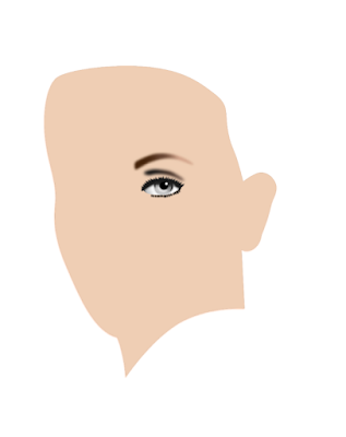


Started drawing the face contour and left eye

When drawing realistic vector portraits, I always start with the eyes, because they are the dominant factor in facial features. For drawing I use the pen tool and the node tool to fine tune. Most objects are given a Gaussian blur effect. Colour management in VectorStyler is very easy to use with great precision.


Stage 15 - vector outline


February 12, 2016

Creepie prez - Yupo paper test

My first impression of the man was that he was creepy. There is a dispute whether he was a satanist, but there was never any doubt that he lead a tough and crappy life, particularly in his younger days. I thought his facial features would lend themselves well for a test of Createx' Yupo airbrush paper. It is a synthetic material, which I had never tried before. I used an A4 size sheet, which basically forced me to spray more delicate lines and areas (large paintings are no challenge). The paint used for the test was Inspire H2O and the airbrush an Iwata HP-BH.

Yupo paper requires very careful appliance of paint - low pressure (barely enough to push out the paint; I never look at the compressor's air pressure gauge) and a mix-ratio of paint : reducer = 1 : 7. The airbrush rarely is further away from the paper than a few millimeters while spraying during the entire test.

Erasing must be done with great caution, especially when using hard material erasers. Erasers made of soft material are more forgiving, allowing to erase controlled fades. Erasers of hard material at some point abruptly remove the paint entirely, leaving a blank spot in an airbrushed area. When used with cautious dexterity they can also be used to erase faded areas, but it remains a tricky enterprise.

As usual, oldest stage at the bottom, newest on top. Findings concerning spraying and erasing on Yupo synthetic paper you see at the end of this page below the images.


Feb 14 2016 12:30 - although one can
never be sure, I think it's finished now...


Feb 13 2016 19:30 - Couldn't leave it 'unfinished'
Did some more work on the portrait...


Feb 12 2016 20:15


Feb 12 2016 15:00


Feb 12 2016 13:00


Feb 12 2016 12:00


Feb 12 2016 - First experiences with Yupo paper
Not sure what to think about synthetic Yupo paper. Perhaps it has to grow on me. I don't think it is an improvement over 'traditional' surfaces; it's very slippery and requires caution in erasing. On the other hand colors sprayed seem more radiant and saturated (provide applied in many layers).

Feb 13 2016 addition - Erasing Yupo paper better understood
Erasing Yupo 2.0 Started to get the hang of it I guess. Yupo allows to bring the white back entirely when erasing correctly. Clay board and various types of paper allow artists to erase back to approximately 90% white, but Yupo goes all the way. Experiment with eraser of different types of hardness / softness. Once the effect of working with various erasers is understood, this type of surface can be very helpful in creating perfect highlights and removing unwanted areas of overspray. I can now imagine that some artists would really like this synthetic surface.

Erasing very thinly sprayed areas is the most tricky; a little too much pressure will remove all paint from the surface. The good news is that the white area, left by accidentally removed paint, is perfectly sprayable and corrections are easy to make. This property also lends itself quite well to soften hard edges caused by masking. I am starting to like Yupo more and more...

Yupo and Inspire H2O
From what I've read (haven't tested it yet) Yupo is not suited for all airbrush paints. But I find that the paper works quite well with Inspire H2O. I discovered that diluting the paint a bit less than I usually do - paint : reducer = 1 : 2 or 1: 3 - will slightly improve adherence to the surface, while not noticeably affecting its handling in the airbrush and worsening the clogging of paint. Artists accustomed to clayboard type of surfaces will need to adjust their spraying and erasing routines somewhat, but once they've done that I think they will appreciate it.

Feb 14 2016 - Yupo's non-absorbtion
I think I figured out why colors look saturated on Yupo and why corrections - spraying over accidentally erased areas - are easy to make. Colors are saturated because none of the pigments are absorbed by the surface; they are all layered on top of the paper and therefore all contribute entirely to the visual effect. Over-saturated areas that sometimes occur when using traditional paper or clayboard are simply not possible. Concerning the erasing: when a mistake in erasing is made, spraying over the area is starting all over again from scratch, not building on the remains that could not be removed. Conclusion: although airbrushing on Yupo required certain adjustments, I came to like it. To artists with above average dexterity and patience I recommend Yupo.


January 17, 2016

Putin airbrush test

Test freehand airbrush:

• Transfer method ( http://goo.gl/90FjbJ )
• Various reducers
• Highlighting white base paint vs erasing
• Type of paper

Transfer method worked well, but reference must be sharper, more detailed and saturated print for better results.
ComArt reducer did not work well at all with Inspire H2O paint. Vallejo reducer worked excellently. Inspire's own reducer worked best.
Erasing sharp edged white areas and highlights gave better looking result than spraying base white.
Schoellershammer paper blurred ultra-fine lines, while previously used Van Beek Retouch paper (200 grs) worked excellently. Paper size: A4.

Test required 27 drops of H2O paint = 162 drops of reducer.


Jan 17 2016 - virtually framed


Crop of completed airbrush test


The size of this test portrait is A4 (210 x 297 mm). It's not very difficult to airbrush lots of details in a huge painting, but it is a challenge to do the same in a small painting. I actually changed Putin's facial expression and made him look slightly more sarcastic. Compare the airbrush with the reference image you see below. The airbrush portrait could have been taken into more detail, but since this is a test, I stopped at the level that is visible above.


May 10, 2015

New kid on the block: waterborne Inspire H2O

When cleaning paint after the airbrush has (visibly) run out of paint, I always pour airbrush cleaner in the gun's paint cup, suck it up and blow it back several times with a pipette. It draws paint residue (paint particles and flakes) into the pipette that I blow from the pipette into the spray-out container so that paint particles and flakes will not clog the nozzle. I do this until no more particles and flakes are visible in the pipette. After that I blow cleaner through the airbrush and also draw back and lock the needle and put my finger on the tip of the nozzle to reverse the flow of the cleaner in the airbrush in order to release stuck paint residue from the airbrush. After that I blow cleaner and finally water through the airbrush.


Spray-out


When cleaning in such a way, it becomes obvious that most paints form particles and flakes that are left in the gun after the airbrush stopped spraying paint. Createx does it, Holbein Aeroflash, Illu-Color and Vallejo Premium all leave some type of residue inside the pipette and on the inner wall of the airbrush paint cup when cleaning according to the method explained above. However, this is not the case with the relatively new waterborne Inspire H2O. The pipette and paint cup remain almost entirely clean.... The first paint I used that has this excellent property.

I also noticed that while mixing the paint before spraying, for which I also use an other pipette to thoroughly mix the paint and reducer, Inspire H2O hardly left any residue in the pipette after the mixing was done. I think that is a sign that the pigmentation is very fine and the binder and solvent are doing a great job. Spraying with Inspire confirmed my suspicion; the paint performed miraculously well in my Iwata Micron SB. Below you see a test that gives an indication of how well this paint behaves.


The measuring scale is in centimeters


To spray the text shown above I used Inspire H2O in the following ratio: Paint : Reducer = 1 : 15 setting the air pressure just high enough to drive out the paint (somewhere around 7 psi or half a bar). But what is more amazing is that after leaving the airbrush untouched for 3 hours (with the paint still in the cup) it sprayed just as well as when I first sprayed it. And it gets better: same thing after 6 hours...., as if spraying with freshly mixed paint.


Inspire H2O 'Black Smoke' and Reducer I used for the test


Another positive property of the H2O paint is that it hardly leaves any tip dry. In this respect it is on par or better than solvent-based paints. And as you can see, the testing was done with black, which traditionally is a 'difficult' color (gross pigment, clogging and tip dry in most brands). Next week I am going to buy other colors of this type of paint and continue to experiment with it. No need to say I am quite impressed by this new paint for airbrush artists.


February 13, 2015

Digital prep for analog painting

I think I am going to shift from airbrushing to painting (in oil) again and from realistic to a more impressionistic style - something somewhere in between the two. I have been fiddling around in order to paint a more vivid and extended palette in software which I find an excellent way to determine the final method of painting in real life with real paint.

An example you see below. I found an image of a beautiful painting by Harley Brown, Called Bitterroot Chief. Though I loved the image composition and palette, I decided to change some facial features and expression. Below you see the original.


Original painting by Harley Brown


I changed the eyebrows - lowered them - and eyelids, as well as the shape of the eyes. Also slightly altered the nose and did some work on the mouth. Native Americans have a number of specific facial features that must be reflected in paintings to keep them 'authentic'. I think I am almost done tinkering in the digital realm and may soon pick up the brush and paints to make a portrait on canvas.


(almost) final digital rendering
before analog (oil) painting


February 15, 2014

Vallejo Premium Airbrush Paint


After recently being struck in a positive way by the excellent characteristics of Com-Art paint I stumbled across Vallejo Premium Paint during a visit to Almere Airbrush Services. Shop owner Eric explained that this paint would adhere to any surface even without applying primer, as long as it would have been degreased. In addition it would be rugged yet flexible after curing. This all sounded almost too good to be true, so I decided to give it a try, not having too much expectations to be honest. Vallejo is best known from providing paints for the model hobby industry, but can be used in a much wider range of applications; the paint is excellently suited to be used in airbrush guns for more delicate operations (i.e. airbrushes with smaller nozzle sizes).