August 5, 2022

Vector portrait of Emma Britten

I originally posted this drawing in 2019, but kept on working on it every now and then (which is what I often do). Many artists are familiar with this method of working, because after 'finishing' a drawing, it is more often than not discovered that the image needs more adjusting and / or additional work. At times this is a repetitively occuring moment, especially with portraits, in which likeness can depend on moving objects 1 or 2 millimeters, changing their size or shape, skewing them or fiddling with their colours. Faces are the most prominent visual characteristic of a person, which is why there is not a photo of your foot in your passport or ID card, but one of your face.

Emma Hardinge Britten was a well known spiritualist who lived from May 2 1823 to October 2 1899. She was a writer, public speaker, musician and opera singer in her younger days to support her family after her father passed away when she was 11 years old. Her spiritual gifts brought her fame and she was frequently consulted by high ranking politicians, corporate leaders and other important people of her day. It is an indication that elevated echelons of society value the spiritual reality that is intentionally kept hidden from common folk.

This portrait is a work in progress and is drawn in Affinity Designer. This program has all the functionality to create realistic vector portraits that can be edited afterwards relatively fast which is a pain to do with mesh-filled vector portraits. And since tinkering is almost a necessity for portrait artists Affinity Designer is their ideal tool to make 100% vector portraits that can be re-scaled to any size without loss of quality. However, this work also contains vector brushes, which are not really vectors - more about this later.


Had to place this here or else the ugly
image below will show up in preview


What makes vector portraits look realistic is that edges of shapes and lines can be blurred in a controlled way. In addition color fadings can be customized in any desired way (using different colours) as well as the transparency of objects (in a linear, radial, elliptical or conical fashion). The combination of these 3 functions allows artists to create works that are visually indistinguishable from pixel portraits, but - as stated before - can be produced in any desired dimension while retaining the original quality.


Ugly Adobe Illustrator attempt (no offence) to
create a realistic vector portrait, b.t.w., this
is caused by Adobe Illustrator's limited
functionality to create realistic art.


Outside of Affinity Designer only the magnificent free open source program Inkscape (which a difficult to learn UI) has similar features, be it that some of them are difficult to find in Inkscape's UI; CorelDRAW and Adobe Illustrator do not have object blur functions, except when converting objects to bitmaps first, and can not be converted back into vectors. These programs are therefore not suited to create realistic vector portraits, other than with the hideously tedious mesh-fill tool. The portraits not made with the mesh fill tool are very unrealitsic looking portraits with hard edges, as is shown in the image above. Adobe's marketing department has tried to turn this into the standard for vector portraits (in which it obviously succeeded) by suggesting that the programs shortcomings are some sort of artistic oddity that they turned into an alleged type of feature. But no matter how one looks at the result, these are not realistic portraits of high quality; they are at best a visual metaphor of realism.


This is the custom vector brush
created to draw realistic strands
of hair. This can be imported in
your collection of brushes and
used for this specific purpose.


This is the custom made brush used
to paint skin pores. Mix dark strokes
and bright strokes combined, the latter
always on top in the layer panel.


Apply 3D and or Bevel / Emboss fx
to the textured brush strokes to
create a realistic skin pore texture
and fiddle with the brush properties
use custom colour and transparency
overlays and underlays, whatever it
takes to approach realism as much
as reasonably possible.


So below you see a realistic vector portrait created in Affinity Designer. Bear in mind that at this point (September 2019) you are looking at the early stages; it will become more realistic as more work is done to the image. Skin pores and detailed strands of hair in particular will be applied. For the hair texture I created a custom brush that allows to create realistic strands, both dark and bright. The oldest stage is at the bottom - more recent stages are placed above that. Click on one of the images and they will be shown in Google's Lightbox, which (on a PC anyway) allows to scroll through the various stages to quickly see and compare the changes. The original size of the portrait in which it was drawn, is 80 x 62 cm, approximately ten times larger than the images submitted to this site.

Mind you - as I found out later - vector brushes in Affinity Designer do NOT create vectors, but are pixels created inside of a vector drawing program, that will remain bitmaps. So when creating realistic art with Affinity Designer, be sure to make large images in order to avoid blurring and jagged edges when using 'vector' brushes, if the intention is to make large prints of the image.


September 20 2019 00:09 virtually in 3D frame


September 20 2019 00:09


September 16 2019 stage 12
vector curves & Brush strokes
outline view (hugely helpful
in the process of drawing)


September 12 2019 11:50


September 11 2019 11:01


September 10 2019 17:20


September 9 2019 20:13


September 9 2019 16:43


September 9 2019 12:20


September 8 2019


September 8 2019


September 8 2019


May 2, 2022

Vector cartoon Mr. Bean


This time a vector cartoon of Mr. Bean, something different from the realistic vector portraits I usually draw. I didn't have to deviate very far from the reality, since his face in real life is already somewhat cartoonish (no offence). Created in the magnificent Affinity Designer - 100% vector, zero pixels. I first drew this image about 2 years ago and recently revisited the image to make some changes. It is what artists often do: walk away from a project to make some changes later, in this case two years, which allowed me to see details that I missed when drawing the initial image.


Rendered view


I refined, tweaked and recoloured a number of areas in the face, in order to add a certain degree of realism to the portrait, while trying not to throw the cartoonish feel out the window. Affinity Designer allows to blur the edges of a curve (object), while gradient colours and transparency are added to it. The programs clipping function allows to draw objects that have various levels of blurriness around their edges, which adds to the realistic atmosphere of a drawing, i.e. not having areas with unrealistic hard edges. I wrote a tutorial on this trick in an other blog post.


Vector outline view


Such a cartoon of a well known person would be perfect to use in a T-shirt design, which of course brings the risk of copyright infringement. I have to see how to deal with this. The circular text around the Bean's is borrowed from one of the quotes of his creator, Rowan Atkinson, who is a fastidious bachelor, that said a thing or two about living alone, that touched up on the heart of this type of life.


Concept T-shirt design, based on one of his quotes


I made a small collage of various cartoons I drew over time and placed it on my website, that contains many variations in style of my artwork. The cartoons below each are drawn in a different style using different techniques.


Part of a cartoon compilation on my website,


I am trying to become familiar with Blender, which is quite a challenge, since its UI is like no other 3D program I have used before. But I guess I have to endure the headaches and frustrations, while attempting to adjust my way of thinking to that of Blender's developer department employees. The program is free, which better relates to the non-existing contents of my bank account.


Psychedelic Bean rendered in virtual 3D frame


Fiddling about wildly with the curve function - placing a heap of nodes on the curve and dragging them to unusual levels, which does surprising things with the colours of an image and sometimes leads to results that are actually worth looking at. The portrait was clipped inside crossing and expanded strokes that I made into wavy lines with the Node tool and then transformed them into curves that can be used to clip other vector objects or pixel images. I wrote a blog entry before on how to do this.


April 16, 2022

Vector butterfly


This was an exercise to draw organic shapes in Affinity Designer. To the curves and strokes gradient colours, opacity and fx were applied. Vector drawing programs are commonly known to produce hard edges, but Affinity Designer is quite well capable of the opposite, which allows to draw realistic vector shapes, that resemble imagery that is created in pixel editing programs, while being re-scalable to any size without loss of quality. Vector images are also easily edited afterwards, easier than pixel art in any event, because each curve and stroke is a separate, editable object.

Affinity Designer allows object edges to be anywhere between hard and soft and even is capable of  creating objects that have a varied level of softness in their edges, that I haven't been able to achieve so effectively and fast in the programs of the competition, while still being able to swiftly edit the blurred edge properties afterwards. The varied level blurring is done by multi-level clipping, gradient opacity and Gaussian blurring effect. Below on top you see the rendered image and below that the vector outline view. Click the images to see them in Google's Lightbox.


The rendered view


The vector outline view


Adobe Illustrator and CorelDRAW offer the Mesh Fill function with which similar looking effects can be achieved. But that technique is nothing but replacing a cluster of pixels of the same colour with a small vector area of one particular colour, that can be manipulated somewhat. Depending on the complexity of the object that is drawn, using this method can require a shedload of work, because all colours involved (in the reference image) have to be mis en place (selected and made available in a colour ribbon before drawing even starts), and each change in color has to be determined to be replaced by a vector area. Affinity Designer allows to use curves and / or strokes that can be clipped in more levels, which makes it easy to edit areas at a later point in time, which is a hell of a chore in Mesh Fill images, even when parts of objects are drawn separately.

In addition Affinity Designer allows to define transparent areas that are adjacent or inside to the colour filled ones or inside them, with either sharp or blurred edges (which are also editable afterwards). So, illustrators and designers that must or want to make images that include organic shapes, are absolutely better served by Affinity Designer. Especially artists that don't have to worry about legacy data from programs of the competition, will find that Designer suits their requirements excellently. 


April 13, 2022

Rasta monkey cartoon


A short blog entry this time. I drew a vector rasta monkey cartoon in Affinity Designer, that I intend to use as a T-shirt design. Below the rendered image you see the vector wireframe view of it, which is quite simple and  hints at the fact that giving strokes and curves different properties and effects, is what really defines the appearance of an image. It also implies that these properties and effects can quickly be changed at a later stage. Click on the images to see larger versions of them in Google's Lightbox.


Vector wire frame view


April 12, 2022

Jugendstil mandala


Mandalas have always fascinated me, as well as Jugendstil designs, particularly ornaments. Without planning to draw either one of them, out of some sort of boredom, I kind of mindlessly started dabbling in Affinity Designer, the result of which you see below. When composing the main drawing, I applied several effects to eh image - the most dominant of which is Gradient Colour overlay that allows black and white images to be enhanced instantly. All values assigned in the settings of effects, colouring and gradients are esoteric / vector math values.


The mandala


The image basically contains two parts, that I have arranged in a 7 element circular pattern, the larger object of which I placed below this paragraph. The objects are embedded in the main drawing.


The larger object


The smaller object, I placed below this paragraph. Click the images to see larger versions of them in Google's Lightbox, that allows to scroll through them by turning the scroll wheel of the mouse.


The smaller object


April 2, 2022

Book cover pages, flyers and educational technical art


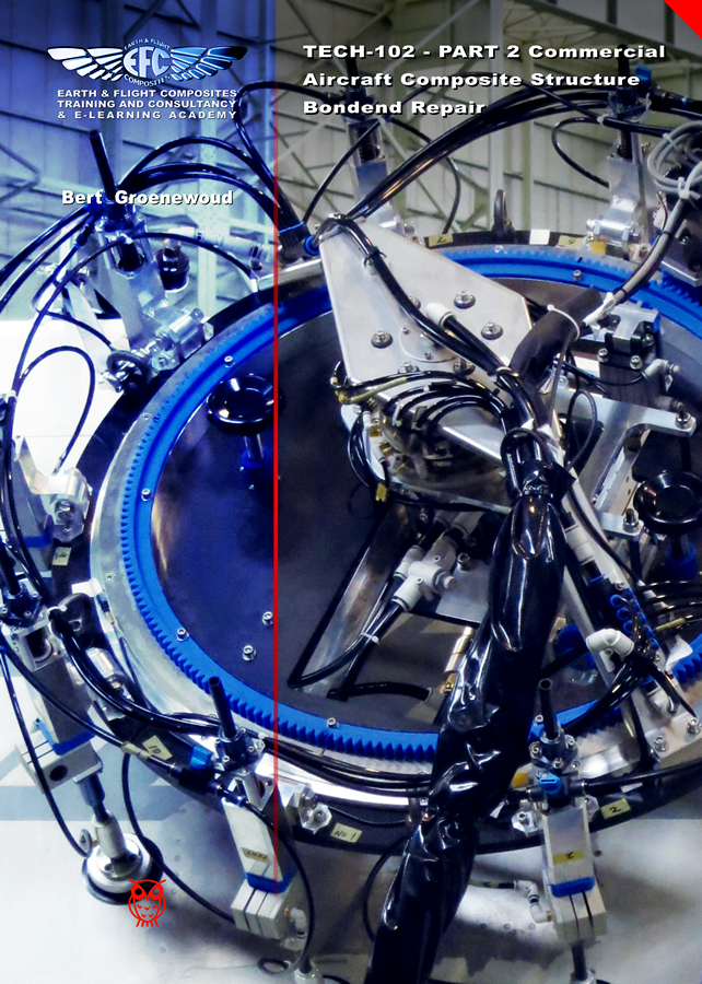
In this blog entry I present some recent cover pages that I have drawn in Affinity Designer, Rhinoceros and Cinema 4D. These were all created in A4 format for educational books in the advanced composite business for a company in which the entrepreneurs each have over 3 decades experience in high-tech companies in the severely regulated aviation and aerospace market. Also I placed some of examples of technical art created in 2D and 3D. The books were created in InDesign up to some 5 years ago, after which I switched to Affinity Publisher. In all of them I drew all images from scratch. These are books, contain a 100 to 300 pages, deal with the complex matter and processes in the advanced composites world.


Composite repair book cover 1 - Affinity Designer


Composite repair book cover 2 - Affinity Designer


Composite fabrication book cover 3 - Affinity Designer 


Some older books that I created from cover to back


One off design concept for Lufthansa - Affinity Designer


SAE report - Affinity Designer


Vacuum bagging method - Rhinoceros 3D


Composite repair student exercise tools - Rhinoceros 3D


Vacuum bag schedule - Rhinoceros 3D


Plain weave schematic - Cinema 4D


Hotbonder - Cinema 4D


Boeing composite locations with numbers for the colour blind - Affinity Designer


Boeing B777 presentation drawing - Cinema 4D


Airbus A350 presentation drawing - Rhinoceros 3D


Vacuum bag connector - Rhinoceros 3D


Honeycomb panel repair layers Rinoveros 3D


Tubular back-up structure - Rhinoceros 3D


Vacuum valves on differently curved surfaces - Rhinoceros 3D


February 21, 2022

Tibetan Falconer vector painting various stages


In the previous blog entry I explained how I made the preliminary study. You may want to peek at this composition for comparison from time to time. In this blog entry I will place the various stages in which I manually draw the entire image in vectors exclusively. My working method is to initially draw parts with a moderate amount of details and later add detail to create a more realistic scene. I will post each stage with the date included. This vector drawing was created in Affinity Designer, but other vector drawing programs may have similar functions. The first image on this page will always be the most recent stage. Note: If you want to see larger versions of the images below, click on them to see those in Google's Lightbox. Press the Escape button on the keyboard to return to the tutorial.


Most recent stage


Since drawing this vector painting is going to be a rather lengthy and complex process (i.e. containing hundreds of objects, perhaps thousands when finished), I will make separate drawings of the various details and embed them in the main file, as I mentioned in the previous blog entry. This approach also keeps the number of objects per sub-object smaller, which allows the artist to maintain oversight and save time.

Stage 01 - The falconer's head (Feb 21 2022)

Below the rendered view of the falconer's head and the vector outline view at this stage. Note how few strokes and curves are used to achieve a relatively realistic appearance. This type of approach in Affinity Designer allows to edit parts quite easily in a brief period of time. The low number of curves and strokes are easy to find in the layers panel and editing each of them requires far less tinkering than the overrated mesh-fill techniques, in which each node represents a cluster of pixels that each have to be edited separately. This feature is in high demand on the Serif forums, but personally I don't miss it at all, because I can do exactly what is necessary to create a realistic image with less effort in less time.


Stage 01 - Rendered view


Stage 01 - Vector outline view


Stage 01 - Overview - where this head is in the overall composition


This KISS-type method of drawing does not only make images easily editable at a later point in time, but also keeps the file-size small, which allows artists to work faster, especially those with a not so powerful computer. The trick with the strokes is, that I manipulated the stroke width (in the Stroke panel) and gradient colour and transparency, while applying the Gaussian blur function to them most of the time, which results in a limited number of objects that make a realistic image nevertheless. Besides strokes a few curves were drawn in places where strokes won't do the job, using the same effects. Curves make it possible to clip other objects into them, which makes it possible to draw more complex shapes that have complex fills. Compared to the number of nodes that mesh-fill operations require, Affinity Designer offers a much more efficient editing method.

When drawing the stages I often deflect from the reference image to enhance the visual impact of images. In this case I made the falconer look straight at the observer and I changed some of his facial features to further enhance the appearance of the drawing.


Stage 02 - The hat (Feb 21 2022)

In this second stage I added the falconer's hat. Again, this is the base; detailing if necessary will be done in a later stage, which probably will involve using the Huion drawing table for the fur texture in the hat. The time I have available to work on this project varies considerably and is quite unpredictable. So check out this page regularly. Below you see the rendered view and the vector outline view.


Stage 02 - Rendered view


Stage 02 - Vector outline view


Although the textures in this drawing are complex, I try to avoid using vector brushes, because they are not really vectors, but actually strokes based on bitmaps, which will affect the quality of the image when re-scaling it to a size larger than the original drawing. This means a part of the texturing has to be hand drawn, but when objects are clipped and grouped in smartly, their properties can be changed instantly in many different ways.


Stage 03 - Base of the coat (Feb 28 2022)

In this stage I began drawing the basic elements of the coat. These basics are important and must be close to the final rendering or at least require minimal tweaking to achieve it. If they are not many changes are required to be applied at a later point in time. While drawing new elements of a drawing some measure of tweaking to already drawn elements are also done in order to maintain the balance in the overall appearance. Below you see a rendering of stage 03.


Stage 03 - Rendered view


The gold coloured ornaments on the collars were had drawn and reshaped using both the Move Tool (used for re-sizing and skewing) and the Node Tool to move nodes to the proper place and adjust their fluency. It would have been handy if Affinity Designer had a Distort Tool, which is one of the view functions I miss in the program, but manipulating these things manually is not too time consuming. Below you see the Vector outline view of this stage.


Stage 03 - Vector outline view


The repetitive smaller ornaments are a multitude of two slashes and an equal sign placed as text along a stroke, to which I applied Gaussian blur, 3D effect and a gradient transparency. I may edit this text at a later point in time to something that makes it difficult to edit when not in possession of the original vector file. So far I estimate I spent about 4 hours on this drawing.


Stage 04 - The falcon / Hawk

In this stage the various sub stages of the drawing of the falcon / hawk are shown. This required some tweaking since the parts were taken from several different photos and combined into one composition. Below you see the first sub stage, which is the drawing of the contour of the bird. Into this numerous objects will be clipped and edited.


1st level of Stage 04 - drawing of the bird's contour


Clipping hierarchy, used to add detail

The foundation of adding complex detail, always is to first draw the contours of an object, whether it is the complete bird, a shadow area or a single feather. Inside this contour - that can have a Gaussian blur, a fill, a gradient fill or a gradient transparency, other objects are clipped that represent the detail, highlighted or shadowed areas. Clipping can be done on multiple levels, for example: a shadowed area may have dark or light accents inside of it; these are clipped inside the already clipped curve inside the contour. Always bear in mind when clipping objects, that the Gaussian blur level of the curves higher in the hierarchy will automatically be applied to the clipped curves or strokes as well. This means that clipped objects will always have the blur level of the curve it is clipped inside or higher - never a lower blur level. If sharper edges are needed, they have to be placed on top of the clipping curve.


2nd level of Stage 04 - first details of bird


January 23, 2022

Varying blurred object edges in Affinity Designer


Following the previous blog entry, I want to share some more detailed tricks to create a single vector object, that has a variety of blur levels along its edges. This technique is useful when drawing realistic images in Affinity Designer, because hard edged objects rarely look realistic in for instance portraits. This technique involves clipping of objects - placing one object inside an other - and gaussian blurring, which is applying a controlled blur ratio to objects. In addition gradient colour fills and gradient opacity can be applied to the objects to attain an appearance that makes objects look realistic. Apart from being useful in drawing realistic vector portraits, flowers and animal drawings, this technique has many other applications for artists who need to give their artwork a convincing realistic appearance.

First some basics. In the image below this paragraph I placed an image in which the basic principle is shown. After that I will go into more complex techniques that are nonetheless based on the same principle. To give an object a blurred edge, click the fx button at the bottom of the Layers panel. In the dialog that pops up after clicking it, at the top of the dialog, the blur ratio can be set in rounded numbers and can even be set precisely in decimal values. That is rather basic, but in reality most objects have edges that have a level of blur in their circumference that varies in a non-linear way. This can not be achieved by just using the fx Gaussian blur function.


Basic clipping and blurring principle


Circle 1 has a blur ratio of 10 (roughly medium blurry) and is clipped inside a grey curve that has a blur ratio of 5 (less blurry). Where the objects intersect, at the top of circle 1, the intersecting area inherits the blur ratio of the grey curve - blur ratio 5, while the rest of the circumference of circle 1 maintains its blur ratio of 10. So at the top of circle 1, the edge is less blurry than in the rest of the circle.

Circle 2 that has a blur ratio of 24, which is more blurry than that of circle 1. Where circle 2 and the grey curve intersect, circle 2 will inherit the blur ratio of the grey curve, so the blurriness at the bottom of circle 2 is far less than in the rest of the circumference of circle 2; there is a greater contrast of blurriness along the edge of circle 2 than there is in circle 1.

By moving the right edge of the grey curve, by selecting the nodes at the top and bottom of its edge with the Node tool, closer to or further away from circle 2, the level of blurredness at the right side of circle 2 can be set quite precisely. Basically, the further away the edge of the parent curve is from that of the clipped child curve, the less its blurriness affects the edge of the child curve. When the edge of the parent curve overlaps the edge of the clipped child curve, the latter inherits the level of blur of the parent curve in the area where the overlapping is defined.

Below this paragraph I placed an image with a transparent curve with a blue outline (for clarity) that has no blurred edge, in which a transparent curve with a green outline is clipped that has a blur ratio of 6, in which a red circle is clipped that has a blur ratio of 50.


Objects clipped inside other objects, with outlines drawn for clarity


The crux is that the parent object in a clip always determines the blurriness of edges. Parent objects can both be given a higher or lower blur ratio than the objects clipped inside of them. If the clipping parent objects have no outline - which is the practical way to work with such a technique - the image shown above would look like the image below this paragraph, indicated by the yellow arrow. The resulting appearance of the clipped red circle becomes clear and this is how clipping and blurring would be used by graphic artists and designers that aim to create realistic objects or parts of objects.


Objects clipped in other objects, without the outlines, which is
how the clipping and blurring would normally be used


In the reality that most people experience, areas that have different ratios of blurriness along their edges, are the majority of what occurs / appears in this dimension. Also objects rarely have one equal colour throughout their shape, which is what in addition to the above, can be applied to the mix by giving objects a gradient colour fill or even clip differently coloured child objects clipped into parent objects to mimic reality even closer. Although what I described in this  blog entry is not always an obvious intuitive mode of operation, Affinity Designer is very capable of coming a long way in 2D design. Programs of Designer's competition may have Mesh Fill options, but creating those sharp, semi blurred and completely blurred object edges requires much more time, while the editing effort afterwards takes even more time.


January 6, 2022

How to avoid hard edges in vector portraits


In the images below cartoonish vector portraits of Rock & Roll legend Elvis Presley can be seen. This image was created in Affinity Designer. After having worked with Adobe Illustrator professionally, CorelDRAW privately and Inkscape occasionally for decades, I have come to the conclusion that the much cheaper one time fee, no subscription Affinity Designer is better suited to create vector portraits that do not have hard edges in the face, even if it does not include the Mesh Fill function, that is very time consuming and tedious to work with. The drawing and editing process - particularly when editing the drawing at a later point in time - in this program takes far less time and effort. Progress sequence of the portrait on the right can be seen in an other blog entry: https://communicats.blogspot.com/.../this-is-other-vector... 


Cartoonish vector portraits of Elvis Presley


The image below this paragraph is a screendump of the vector outline of the double portrait. Extensive use was made of Affinity Designers Gaussian blur function, which allows to avoid hard edges in the facial features, as are often seen in vector portraits created in Adobe Illustrator. Many of the curves with which areas on the face were drawn are made by applying multiple node gradient fills and gradient transparency. This method allows to quickly edit (also afterwards) of the drawing which is much faster than while using mesh gradient fill tool that isn't present in Affinity Designer. Personally, I don't miss it. A brilliant Russian artist who works with mesh fills in CorelDRAW once revealed that it took him months to draw a vector portrait, while it is possible in Affinity Designer to make the same effect in much less time. I used CorelDRAW for many years, but only after accidentally running across Affinity Designer I was able to create realistic vector portraits a lot quicker, while making editing afterwards easier and faster. More examples of realistic vector portraits and illustrations can be found in my website at: https://vectorwhiz.com/Vector.html


Vector outline view of the Elvis portraits


To create (gradient) tints and blurs in the facial area of a vector portrait, it often is necessary to draw curves that have a variable level of blur along their edges, meaning that some edge parts are just slightly unsharp, while other parts are blurred and yet other parts are very blurry. To achieve this effect, I apply the following technique that is below this paragraph:

In these vector portraits a Gaussian blur trick was applied in Affinity Designer, as can be seen in the third image. Ellipse 3 is clipped inside Circle 2 and circle 2 is clipped inside circle 1. In the image below you see, Circle 1 is transparent, the other two objects are opaque. Circle 1 has a minimal blur rate, Circle 2 has a higher blur rate and Ellipse 3 has the highest blur rate. The result of these settings are that circle one has an unsharp edge, circle 2 has a blurred edge to the left and an unsharp one to the right, while Ellipse 3 has a very blurry edge on the left and a less blurred towards the right. The blur values are indicated in the third image. The circle with the dotted line only serves to indicate the position and size of Circle 1 that is completely transparent, slightly blurred and used to clip the other objects.


Example drawing of Gaussian blur effects and object clipping


In the image below the Layer panel is shown containing the hierarchy of the objects in the image above this paragraph. Objects that are indented to the right are clipped inside the ones above them. The object names correspond with those in the Example drawing. The circles and ellipse are at the bottom of the panel. The objects marked with an 'A' thumbnail refer to the text in the Example drawing.


Object position in the Layer Panel


In addition all parts can be given a colour gradient and gradient transparency, all settings that are independently editable of the ones described above this paragraph. In doing so the annoying hard edges of shadows in the face of a vector portrait can be avoided that are almost always seen in vector portraits created in Adobe Illustrator. Adobe's marketing machine has managed to present this lack of functionality as some sort of gimmick, but I dislike such vector portraits. Affinity Designer allows to create far more realistic vector portraits in a much easier way that vector portraits created with the mesh fill function. The added benefit of working in this way is that at a later point in time all the parameters can be edited and tweaked to the preference of the vector portrait artist. Working in vectors with this method allows to resize the portrait without any loss of quality. Of course this technique can be applied to any shape you can draw, not just to circles and ellipses, that I used in the example above, as can be seen in the completed vector double portrait at the top of this blog entry and the vector outline view screen dump below it.