April 12, 2022

Jugendstil mandala


Mandalas have always fascinated me, as well as Jugendstil designs, particularly ornaments. Without planning to draw either one of them, out of some sort of boredom, I kind of mindlessly started dabbling in Affinity Designer, the result of which you see below. When composing the main drawing, I applied several effects to eh image - the most dominant of which is Gradient Colour overlay that allows black and white images to be enhanced instantly. All values assigned in the settings of effects, colouring and gradients are esoteric / vector math values.


The mandala


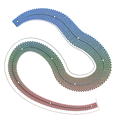
The image basically contains two parts, that I have arranged in a 7 element circular pattern, the larger object of which I placed below this paragraph. The objects are embedded in the main drawing.


The larger object


The smaller object, I placed below this paragraph. Click the images to see larger versions of them in Google's Lightbox, that allows to scroll through them by turning the scroll wheel of the mouse.


The smaller object


April 2, 2022

Book cover pages, flyers and educational technical art


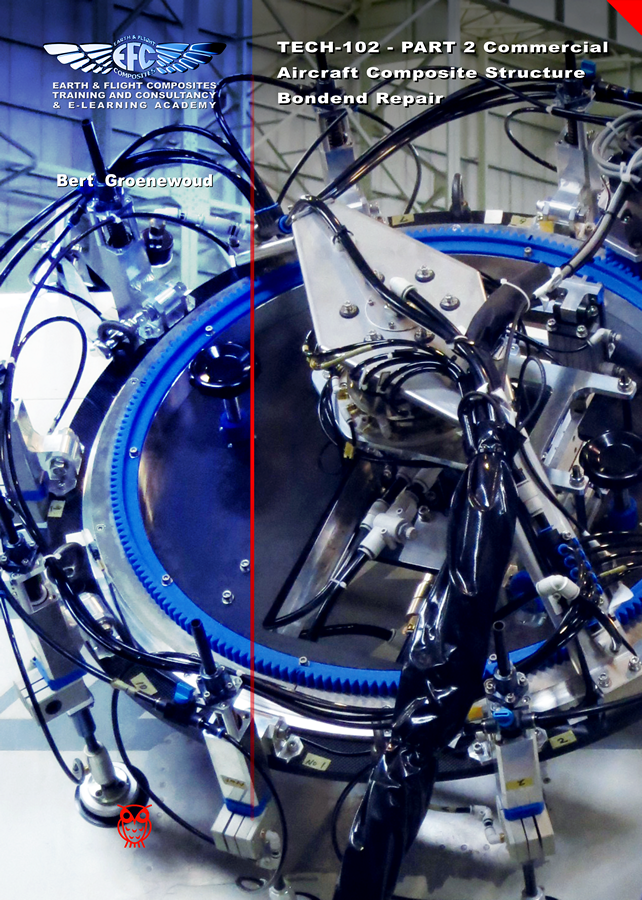
In this blog entry I present some recent cover pages that I have drawn in Affinity Designer, Rhinoceros and Cinema 4D. These were all created in A4 format for educational books in the advanced composite business for a company in which the entrepreneurs each have over 3 decades experience in high-tech companies in the severely regulated aviation and aerospace market. Also I placed some of examples of technical art created in 2D and 3D. The books were created in InDesign up to some 5 years ago, after which I switched to Affinity Publisher. In all of them I drew all images from scratch. These are books, contain a 100 to 300 pages, deal with the complex matter and processes in the advanced composites world.


Composite repair book cover 1 - Affinity Designer


Composite repair book cover 2 - Affinity Designer


Composite fabrication book cover 3 - Affinity Designer 


Some older books that I created from cover to back


One off design concept for Lufthansa - Affinity Designer


SAE report - Affinity Designer


Vacuum bagging method - Rhinoceros 3D


Composite repair student exercise tools - Rhinoceros 3D


Vacuum bag schedule - Rhinoceros 3D


Plain weave schematic - Cinema 4D


Hotbonder - Cinema 4D


Boeing composite locations with numbers for the colour blind - Affinity Designer


Boeing B777 presentation drawing - Cinema 4D


Airbus A350 presentation drawing - Rhinoceros 3D


Vacuum bag connector - Rhinoceros 3D


Honeycomb panel repair layers Rinoveros 3D


Tubular back-up structure - Rhinoceros 3D


Vacuum valves on differently curved surfaces - Rhinoceros 3D


February 21, 2022

Tibetan Falconer vector painting various stages


In the previous blog entry I explained how I made the preliminary study. You may want to peek at this composition for comparison from time to time. In this blog entry I will place the various stages in which I manually draw the entire image in vectors exclusively. My working method is to initially draw parts with a moderate amount of details and later add detail to create a more realistic scene. I will post each stage with the date included. This vector drawing was created in Affinity Designer, but other vector drawing programs may have similar functions. The first image on this page will always be the most recent stage. Note: If you want to see larger versions of the images below, click on them to see those in Google's Lightbox. Press the Escape button on the keyboard to return to the tutorial.


Most recent stage


Since drawing this vector painting is going to be a rather lengthy and complex process (i.e. containing hundreds of objects, perhaps thousands when finished), I will make separate drawings of the various details and embed them in the main file, as I mentioned in the previous blog entry. This approach also keeps the number of objects per sub-object smaller, which allows the artist to maintain oversight and save time.

Stage 01 - The falconer's head (Feb 21 2022)

Below the rendered view of the falconer's head and the vector outline view at this stage. Note how few strokes and curves are used to achieve a relatively realistic appearance. This type of approach in Affinity Designer allows to edit parts quite easily in a brief period of time. The low number of curves and strokes are easy to find in the layers panel and editing each of them requires far less tinkering than the overrated mesh-fill techniques, in which each node represents a cluster of pixels that each have to be edited separately. This feature is in high demand on the Serif forums, but personally I don't miss it at all, because I can do exactly what is necessary to create a realistic image with less effort in less time.


Stage 01 - Rendered view


Stage 01 - Vector outline view


Stage 01 - Overview - where this head is in the overall composition


This KISS-type method of drawing does not only make images easily editable at a later point in time, but also keeps the file-size small, which allows artists to work faster, especially those with a not so powerful computer. The trick with the strokes is, that I manipulated the stroke width (in the Stroke panel) and gradient colour and transparency, while applying the Gaussian blur function to them most of the time, which results in a limited number of objects that make a realistic image nevertheless. Besides strokes a few curves were drawn in places where strokes won't do the job, using the same effects. Curves make it possible to clip other objects into them, which makes it possible to draw more complex shapes that have complex fills. Compared to the number of nodes that mesh-fill operations require, Affinity Designer offers a much more efficient editing method.

When drawing the stages I often deflect from the reference image to enhance the visual impact of images. In this case I made the falconer look straight at the observer and I changed some of his facial features to further enhance the appearance of the drawing.


Stage 02 - The hat (Feb 21 2022)

In this second stage I added the falconer's hat. Again, this is the base; detailing if necessary will be done in a later stage, which probably will involve using the Huion drawing table for the fur texture in the hat. The time I have available to work on this project varies considerably and is quite unpredictable. So check out this page regularly. Below you see the rendered view and the vector outline view.


Stage 02 - Rendered view


Stage 02 - Vector outline view


Although the textures in this drawing are complex, I try to avoid using vector brushes, because they are not really vectors, but actually strokes based on bitmaps, which will affect the quality of the image when re-scaling it to a size larger than the original drawing. This means a part of the texturing has to be hand drawn, but when objects are clipped and grouped in smartly, their properties can be changed instantly in many different ways.


Stage 03 - Base of the coat (Feb 28 2022)

In this stage I began drawing the basic elements of the coat. These basics are important and must be close to the final rendering or at least require minimal tweaking to achieve it. If they are not many changes are required to be applied at a later point in time. While drawing new elements of a drawing some measure of tweaking to already drawn elements are also done in order to maintain the balance in the overall appearance. Below you see a rendering of stage 03.


Stage 03 - Rendered view


The gold coloured ornaments on the collars were had drawn and reshaped using both the Move Tool (used for re-sizing and skewing) and the Node Tool to move nodes to the proper place and adjust their fluency. It would have been handy if Affinity Designer had a Distort Tool, which is one of the view functions I miss in the program, but manipulating these things manually is not too time consuming. Below you see the Vector outline view of this stage.


Stage 03 - Vector outline view


The repetitive smaller ornaments are a multitude of two slashes and an equal sign placed as text along a stroke, to which I applied Gaussian blur, 3D effect and a gradient transparency. I may edit this text at a later point in time to something that makes it difficult to edit when not in possession of the original vector file. So far I estimate I spent about 4 hours on this drawing.


Stage 04 - The falcon / Hawk

In this stage the various sub stages of the drawing of the falcon / hawk are shown. This required some tweaking since the parts were taken from several different photos and combined into one composition. Below you see the first sub stage, which is the drawing of the contour of the bird. Into this numerous objects will be clipped and edited.


1st level of Stage 04 - drawing of the bird's contour


Clipping hierarchy, used to add detail

The foundation of adding complex detail, always is to first draw the contours of an object, whether it is the complete bird, a shadow area or a single feather. Inside this contour - that can have a Gaussian blur, a fill, a gradient fill or a gradient transparency, other objects are clipped that represent the detail, highlighted or shadowed areas. Clipping can be done on multiple levels, for example: a shadowed area may have dark or light accents inside of it; these are clipped inside the already clipped curve inside the contour. Always bear in mind when clipping objects, that the Gaussian blur level of the curves higher in the hierarchy will automatically be applied to the clipped curves or strokes as well. This means that clipped objects will always have the blur level of the curve it is clipped inside or higher - never a lower blur level. If sharper edges are needed, they have to be placed on top of the clipping curve.


2nd level of Stage 04 - first details of bird


January 23, 2022

Varying blurred object edges in Affinity Designer


Following the previous blog entry, I want to share some more detailed tricks to create a single vector object, that has a variety of blur levels along its edges. This technique is useful when drawing realistic images in Affinity Designer, because hard edged objects rarely look realistic in for instance portraits. This technique involves clipping of objects - placing one object inside an other - and gaussian blurring, which is applying a controlled blur ratio to objects. In addition gradient colour fills and gradient opacity can be applied to the objects to attain an appearance that makes objects look realistic. Apart from being useful in drawing realistic vector portraits, flowers and animal drawings, this technique has many other applications for artists who need to give their artwork a convincing realistic appearance.

First some basics. In the image below this paragraph I placed an image in which the basic principle is shown. After that I will go into more complex techniques that are nonetheless based on the same principle. To give an object a blurred edge, click the fx button at the bottom of the Layers panel. In the dialog that pops up after clicking it, at the top of the dialog, the blur ratio can be set in rounded numbers and can even be set precisely in decimal values. That is rather basic, but in reality most objects have edges that have a level of blur in their circumference that varies in a non-linear way. This can not be achieved by just using the fx Gaussian blur function.


Basic clipping and blurring principle


Circle 1 has a blur ratio of 10 (roughly medium blurry) and is clipped inside a grey curve that has a blur ratio of 5 (less blurry). Where the objects intersect, at the top of circle 1, the intersecting area inherits the blur ratio of the grey curve - blur ratio 5, while the rest of the circumference of circle 1 maintains its blur ratio of 10. So at the top of circle 1, the edge is less blurry than in the rest of the circle.

Circle 2 that has a blur ratio of 24, which is more blurry than that of circle 1. Where circle 2 and the grey curve intersect, circle 2 will inherit the blur ratio of the grey curve, so the blurriness at the bottom of circle 2 is far less than in the rest of the circumference of circle 2; there is a greater contrast of blurriness along the edge of circle 2 than there is in circle 1.

By moving the right edge of the grey curve, by selecting the nodes at the top and bottom of its edge with the Node tool, closer to or further away from circle 2, the level of blurredness at the right side of circle 2 can be set quite precisely. Basically, the further away the edge of the parent curve is from that of the clipped child curve, the less its blurriness affects the edge of the child curve. When the edge of the parent curve overlaps the edge of the clipped child curve, the latter inherits the level of blur of the parent curve in the area where the overlapping is defined.

Below this paragraph I placed an image with a transparent curve with a blue outline (for clarity) that has no blurred edge, in which a transparent curve with a green outline is clipped that has a blur ratio of 6, in which a red circle is clipped that has a blur ratio of 50.


Objects clipped inside other objects, with outlines drawn for clarity


The crux is that the parent object in a clip always determines the blurriness of edges. Parent objects can both be given a higher or lower blur ratio than the objects clipped inside of them. If the clipping parent objects have no outline - which is the practical way to work with such a technique - the image shown above would look like the image below this paragraph, indicated by the yellow arrow. The resulting appearance of the clipped red circle becomes clear and this is how clipping and blurring would be used by graphic artists and designers that aim to create realistic objects or parts of objects.


Objects clipped in other objects, without the outlines, which is
how the clipping and blurring would normally be used


In the reality that most people experience, areas that have different ratios of blurriness along their edges, are the majority of what occurs / appears in this dimension. Also objects rarely have one equal colour throughout their shape, which is what in addition to the above, can be applied to the mix by giving objects a gradient colour fill or even clip differently coloured child objects clipped into parent objects to mimic reality even closer. Although what I described in this  blog entry is not always an obvious intuitive mode of operation, Affinity Designer is very capable of coming a long way in 2D design. Programs of Designer's competition may have Mesh Fill options, but creating those sharp, semi blurred and completely blurred object edges requires much more time, while the editing effort afterwards takes even more time.


January 6, 2022

How to avoid hard edges in vector portraits


In the images below cartoonish vector portraits of Rock & Roll legend Elvis Presley can be seen. This image was created in Affinity Designer. After having worked with Adobe Illustrator professionally, CorelDRAW privately and Inkscape occasionally for decades, I have come to the conclusion that the much cheaper one time fee, no subscription Affinity Designer is better suited to create vector portraits that do not have hard edges in the face, even if it does not include the Mesh Fill function, that is very time consuming and tedious to work with. The drawing and editing process - particularly when editing the drawing at a later point in time - in this program takes far less time and effort. Progress sequence of the portrait on the right can be seen in an other blog entry: https://communicats.blogspot.com/.../this-is-other-vector... 


Cartoonish vector portraits of Elvis Presley


The image below this paragraph is a screendump of the vector outline of the double portrait. Extensive use was made of Affinity Designers Gaussian blur function, which allows to avoid hard edges in the facial features, as are often seen in vector portraits created in Adobe Illustrator. Many of the curves with which areas on the face were drawn are made by applying multiple node gradient fills and gradient transparency. This method allows to quickly edit (also afterwards) of the drawing which is much faster than while using mesh gradient fill tool that isn't present in Affinity Designer. Personally, I don't miss it. A brilliant Russian artist who works with mesh fills in CorelDRAW once revealed that it took him months to draw a vector portrait, while it is possible in Affinity Designer to make the same effect in much less time. I used CorelDRAW for many years, but only after accidentally running across Affinity Designer I was able to create realistic vector portraits a lot quicker, while making editing afterwards easier and faster. More examples of realistic vector portraits and illustrations can be found in my website at: https://vectorwhiz.com/Vector.html


Vector outline view of the Elvis portraits


To create (gradient) tints and blurs in the facial area of a vector portrait, it often is necessary to draw curves that have a variable level of blur along their edges, meaning that some edge parts are just slightly unsharp, while other parts are blurred and yet other parts are very blurry. To achieve this effect, I apply the following technique that is below this paragraph:

In these vector portraits a Gaussian blur trick was applied in Affinity Designer, as can be seen in the third image. Ellipse 3 is clipped inside Circle 2 and circle 2 is clipped inside circle 1. In the image below you see, Circle 1 is transparent, the other two objects are opaque. Circle 1 has a minimal blur rate, Circle 2 has a higher blur rate and Ellipse 3 has the highest blur rate. The result of these settings are that circle one has an unsharp edge, circle 2 has a blurred edge to the left and an unsharp one to the right, while Ellipse 3 has a very blurry edge on the left and a less blurred towards the right. The blur values are indicated in the third image. The circle with the dotted line only serves to indicate the position and size of Circle 1 that is completely transparent, slightly blurred and used to clip the other objects.


Example drawing of Gaussian blur effects and object clipping


In the image below the Layer panel is shown containing the hierarchy of the objects in the image above this paragraph. Objects that are indented to the right are clipped inside the ones above them. The object names correspond with those in the Example drawing. The circles and ellipse are at the bottom of the panel. The objects marked with an 'A' thumbnail refer to the text in the Example drawing.


Object position in the Layer Panel


In addition all parts can be given a colour gradient and gradient transparency, all settings that are independently editable of the ones described above this paragraph. In doing so the annoying hard edges of shadows in the face of a vector portrait can be avoided that are almost always seen in vector portraits created in Adobe Illustrator. Adobe's marketing machine has managed to present this lack of functionality as some sort of gimmick, but I dislike such vector portraits. Affinity Designer allows to create far more realistic vector portraits in a much easier way that vector portraits created with the mesh fill function. The added benefit of working in this way is that at a later point in time all the parameters can be edited and tweaked to the preference of the vector portrait artist. Working in vectors with this method allows to resize the portrait without any loss of quality. Of course this technique can be applied to any shape you can draw, not just to circles and ellipses, that I used in the example above, as can be seen in the completed vector double portrait at the top of this blog entry and the vector outline view screen dump below it.


December 27, 2021

Creating my personal crest in Affinity Designer and Photo


In this blog entry I briefly explain how I made my personal crest of which below you see the image. The main challenge was to find a way how to draw the snake's scale texture inside its winding body that also is narrower towards its tail section. After some trial and error I figured out a way to do it. 

The completed rendered drawing


First I did some testing in a separate drawing in order to be able to create the scales texture I had in my mind. To make the scales I drew and duplicated diamond shapes, with the result you see below. It is an early version, because the one I actually used, is too long for this blog, but this one gives a good idea of how I drew them. 

The first attempt to draw the base of a vector brush in Affinity Designer


After drawing these, I inverted the image and mesh warped it in Affinity Photo as is visible in the image below to kind of approach the texture width inside the winding and tapered body of the snake. It is possible to leave the diamonds unmeshed in a rectangular shape, but playing with the Stroke width only in Designer, to spread the scales properly over the body, leads to distortion of the texture. Hence this preliminary approximation. The inversion was done, because png's that are used for custom brushes must have a black background to make sure the brush has a transparent background once imported in Designer.

The brush visible above mesh warped and inverted in Affinity Photo


I created a png of the above and imported it in Affinity Designer as a New Texture Intensity Brush in Designer. In the Brush dialog I set the Size Variance to high in order to be able to tweak the brush's width to the desired value. If the Size Variance is left at default zero, it is impossible to tweak the width of the brush afterwards in the Stoke panel.


Then I did some testing in yet an other separate drawing that you see below. Tinkering with the stroke width in Affinity Designer and manipulating the node handles of the vector brush allows to get rid of unwanted interference of the scales. I then found out that I had to draw different brushes (particularly longer ones since the snake's body is of considerable length) in Designer that were edited in the same way as described above in Affinity Photo, to be able to make a more realistic scale texture. For such purposes trial and error to get things right is difficult to avoid. By the way, vector brushes can be given any (gradient) colour in Designer as demonstrated in the image below.

Testing of the (not clipped) vector brush in Affinity Designer


I drew the base for the texture with Designer's Pen tool, so that it could be edited accurately with the Node tool. Then I applied the Vector Brush to the stroke drawn with the Pen by double clicking on the Brush type, while the stroke is selected. Inside Designer I then clipped the vector brush inside the snake outline curve as is seen in the image below. I tweaked the brush widths in Designer's Stroke panel along the vector brush line to the proper values. Also, in the Effects panel I applied a colour overlay to tune the texture to the correct intensity.


The clipping of the custom made vector brush in Affinity Designer


Below is the deceptively simple screendump of the vector outline of this image. The essence of this drawing is within the effects applied (the feature rich Layer Adjustment & Layer Effect tools, Gradient fill tool for shapes and strokes, Gradient opacity tool) to the vector curves at which Affinity Designer excels. Attempting to match the vision in the mind's eye is a challenge, but the Affinity programs allow artists to come a long way.


Vector outline of the drawing


Finally in the Tone Mapping Persona of Affinity Photo, I enhanced the texture of the vector drawing, with the result that is visible in the image at the top of this blog entry. The Tone Mapping (to my surprise) resulted in a kind of patina effect to the shield, which I think is quite nice. It probably is the result of the multi node gradient colour function applied to the shield in combination with the Tone Mapping settings.

Note: The version of the brush I used in the end, is quite large (4208 x 164 pixels) in order to be able to properly render this image also in large sizes without getting a jagged and blurred appearance, because the drawing contains pixel elements in its complex non-linear textures.

My Chinese Zodiac sign is a Water Snake, which is the main feature of this personal crest. The meaning of the arched Latin text is 'Serpent Power' or 'Serpent Kingdom'. The X is a symbol of the Sun God who sustains life, secrecy or protection of (mystical) knowledge. The circle represents magical protection and sacred space. The mistletoes refer to protection against poisons and to mystical powers. 11 and 22 are master numbers pertaining to my birth date and name, according to the art of numerology. The infinity symbol at the bottom hints at my spiritual origin. Only after having reached the age of an elder was I considered to have grown sufficiently to understand that a symbol is worth a 1000 pictures. 

Hope this concise tutorial helps to create similar textures.


December 16, 2021

After two months of working with Nicepage


After just over two months of working with Nicepage, I remain enthusiastic about the program, after having bad experiences with MobiRise and PineGrow. I realize that maturing such a complex program requires time and effort. After all it has managed to allow website designers to break away from the restrictive blocks, object and element positioning of the bootstrap based programs, which is no small feat. In addition it has brought an interface that makes it ridiculously easy to learn how to use the program within a brief period of time, besides adding a ton of functions, like animation of images, icons and shapes that allows to create webpages of a different level. The integration with CMS systems like WordPress and its open source equivalent Joomla make it applicable to a much wider range of websites. Particularly since both systems support a ton of plugins, like ecommerce, that makes building web shops possible. In today's lockdowns and restrictive access to public provisions, creating online sales points have become a lifeline for many.


Click the image to visit the Nicepage website


The minor flaws that I have run into, will be corrected really fast, I'm sure, because I have noticed that the support department on their forum page responds quickly, which probably results in the high update pace of the program. Communication with the mods on the Nicepage forum is done from within the program as well, by the way, which is quite a useful feature. Since I started to use it approximately 2 months ago, there have been some 5 updates, all of which can be installed from within the program, while offering the possibility to back up the created sites before updating. I did not have to use this option, because the updates did not cause any problems, which hints at the fact that the developers do some sound testing before releasing the updates. All in all, these are positive experiences some of which I haven't encountered while using other programs that I used previously. So, for me, switching to Nicepage was a perfectly on the mark decision. 


Updating Nicepage from within the program


The minor flaws I referred to in the previous paragraph concerned to sometimes fiddly positioning of elements (text and images), in automated fluid repositioning of them in laptop, tablet and mobile devices resolutions and screen orientation. With some trial and error these can all be corrected quite easily however. Other programs I used, preform much worse in this department. Note: making sites work for display on multiple screen resolutions and orientations in an environment that is more complex than the popular, but restrictive object positioning bootstrap method, is quite an achievement. An other weird flaw I encountered, is the colouring of the bullets in a bulleted list, that strangely enough works on Opera's android vertical webpages for mobile devices, but not in the desktop versions of Opera and other browsers. Bearing in mind the proven prowess of the Nicepage developers, however, this is an oddity that they should easily be able to correct.

In the near future I plan to test Nicepage in combination with Joomla to add ecommerce functionality to a website. This will have to be done in a sub-domain that I will need to create, since my own site does not require the use of Joomla. Stay tuned to learn of my experiences with this type of web site building.

Another nice feature of Nicepage are the Animation options, that allows designers to draw the attention of the website visitors to a particular area of the page. These all work flawlessly and are fully customizable. It shows the attention to details of the developers that really understand the needs of designers.


Animating images and icons etc. in Nicepage


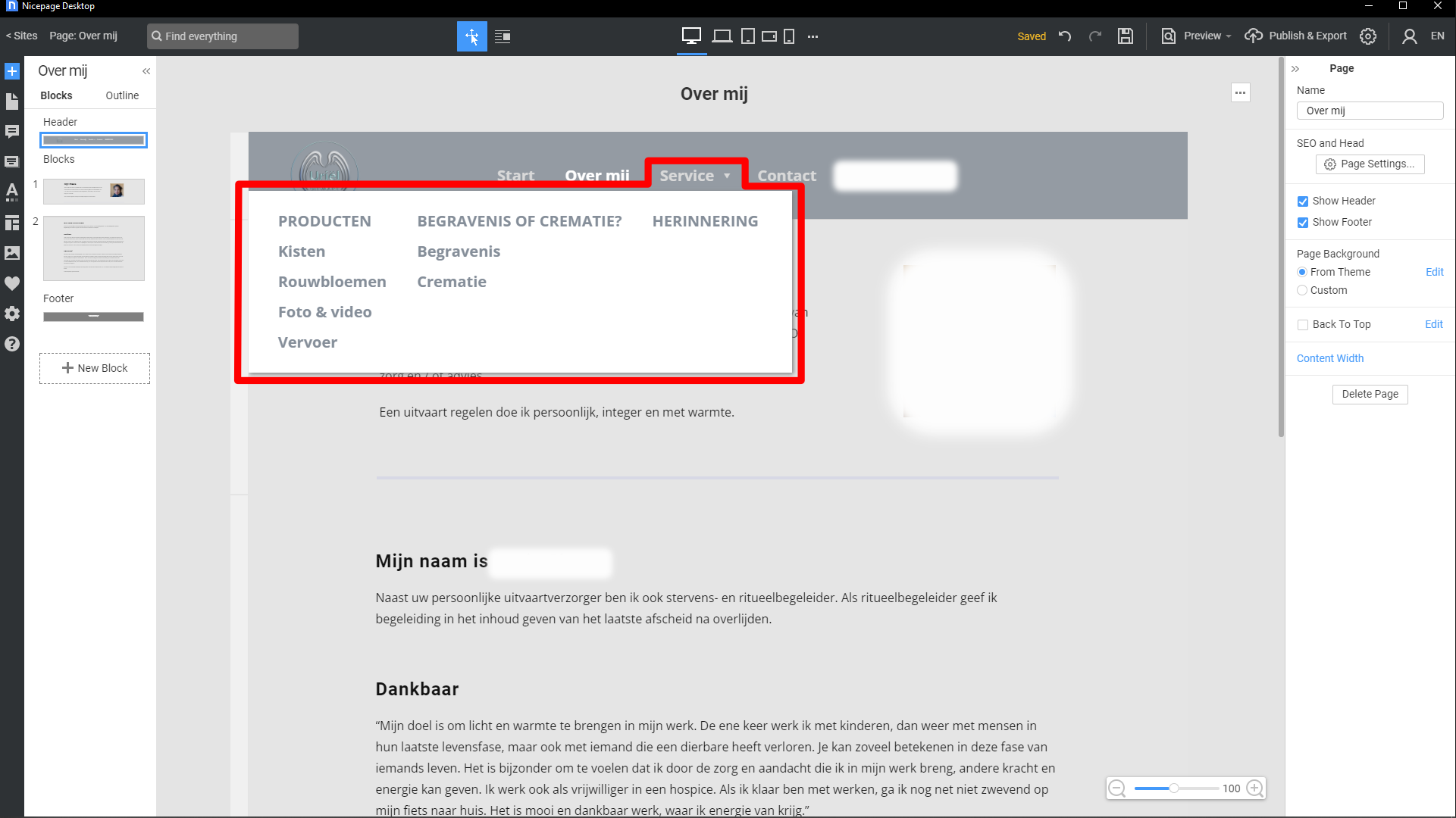
While on the subject of understanding what designers need - the recently introduced Mega Menu allows designers to create a so called (you guessed it) Mega Menu, in which visitors immediately see what the categories in the dropdown options are in a clear way. So the developers tailor the program to the designer's needs who then can create a website tailored to the visito's needs. Absolutely great!


The Nicepage Mega Menu


What has also become perfectly possible with Nicepage is to build websites, without outsourcing the UI / UX-design, since the program has a functionality and flexibility that its competition lacks. These features could potentially speed up the creative process, because the UI / UX design phase can be skipped entirely. In these times of budget cuts and decreased face to face communication, Nicepage may save businesses a considerable amount of costs, while freelancing website builders can accept more different types of assignments and accomplish them in less time, while being able to include visually more appealing effects in the sites they build. This makes the program the ideal choice for the designers that do not have a whole lot of legacy data to take into account. The plethora of templates the company offers makes many assignments a breeze, in addition to which these are easily editable, which includes the perpetually changing SEO requirements. Especially for non-coders this program is a dream, because it allows them to do things that required a lot of skilled coding in the past. Coding costs skill and time and the program makes creative design accessible to anyone. If you want to get a proper idea of the possibilities and use of Nicepage, take a peek at this video: https://www.youtube.com/watch?v=8iHl--K4XPs


October 26, 2021

Nicepage site builder made my jaw drop


In the early days of the web, text only pages were all that existed. Somewhat later images were added to some pages, which gradually evolved into the media rich bootstrap method of website building that allowed to place text boxes, images, tables and videos on fixed grid positions. Meanwhile at this point in time (October 26 2021) the 5th version of Bootstrap has been released which includes minor updates and possibilities compared to the previous version. The type of websites in the first days of the Internet was called Web 1.0. Bootstrap sites are Web 2.0 type sites and now it is possible to build Web 3.0 type sites that allows text boxes, images, videos, tables and shapes to be placed anywhere on the page and even on top of an other object, making overlapping of objects possible. No more restriction of having to place objects within the coercive matrix of the bootstrap grid; just place, resize and scale objects anywhere you want, without writing a single line of code.... In addition, you are free to determine the object's rank along the Z-axis. It is the web designer's dream, because it allows them to focus on exciting esthetics instead of dull, tedious  and time consuming coding. Hardcore coders may still prefer it, but the rest if the world doesn't, particularly creative webdesigners, that Nicepage offers the option to whatever they want without the need to code.

The program that makes all this possible is called  nicepage . Just draw elements anywhere on the page and move, resize, scale, reshape and reorder in the Z-axis, determining which object is above or below the other. Nicepage's UI is very intuitive and contains loads of functions that are absent in the programs of the competition. Discovering nicepage was kind of a gift from heaven to me since MobiRise suddenly made it impossible to add blocks, which is kind of a crucial function in web design. On the forum mods simply wrote: 'Yeah we know it affects some users', without offering any solution whatsoever (....). For website builders that work for clients this is disastrous - they are stuck and cannot make changes their customers require. It basically makes the program totally useless. After watching a few videos on Youtube that explained the features and use of nicepage I was won over and bought nicepage. Mind you it costs a one time fee, which includes free upgrades for the period of one year and you own the program for life. Below you see the first attempt of rebuilding my home page, which allowed to incorporate subtleties that are impossible or at least excruciatingly difficult to make with Bootstrap based editors (which makes a ton of CSS coding necessary). So, for non-coders such as me, nicepage most definitely is the way to go.


Rebuilding my home page in nicepage


Update November 1 2021 - Nicepage features
I uploaded my website that was created in nicepage. Still learning and checking for errors although I think most of the major ones have been corrected, but fine tuning will be done in the time to come - editing for mobile devices, the adding of links, SEO etc. A few features of the program that make it pleasure to work with:

  • Export to local directory, WordPress, Joomla and via FTP runs very fast. Integrated FTP function is quite useful
  • The structured nature of the program saves a lot of time - site wide changes (in Menu, Header and Footer) can be made in a flash
  • Numerous prefabricated types of grids can be inserted to any Block and then be resized (or not) to the designer's liking
  • Images can be made to fill a grid area in a block with one click or be scaled to the desired size manually with an accuracy to the pixel or be cropped to the designer's preference
  • The option to edit the site for all sorts of devices works flawlessly - objects can be edited for each device (including hiding objects for a particular device) without affecting the design for other device resolutions
  • The artistic freedom - without any coding - that the program offers is simply stunning. Web 3.0 is a dream for creative web designers. Unrestricted positioning of objects and possibility to change their order in the Z-stack among the most useful features
  • The positioning and sizing of objects can be carried out manually or with the properties panel with pixel precision
  • The interactive guides are a great asset that helps edit a lot faster, on the fly, manually
  • Text formatting is non-restrictive - colour, bold, italics, underlined, hyperlink insertion all are possible
  • Hyperlinks can be made to visit URL's, write e-mails, make telephone calls and be linked to files to be uploaded
  • Alignment can be applied to blocks with all objects in it or to individual elements that may have a different alignment compared to other elements in the same block
  • There also is an outline view which is useful when locating and editing objects in a complex lay-out in which many objects are stacked in the Z-axis. In this view the ranking of objects in the Z-stack can be changed by dragging objects up or down - images are named 'images', text blocks are represented by a capital 'T' and the first two words of the text, lines are named 'line', cells are named 'Cell' and grids are named "grid' - a consistently logical syntax
  • When copying text from other documents that contain links, the hyperlinks are automatically copied as well (not all web editors to this) - a time saver in many cases
  • The program has plugins for WordPress (12 widgets so far) and Joomla, which greatly enhance its usability for more advanced WordPress users and designers working with Joomla
  • Nicepage has thousands of prefabricated templates (9000+ and counting), blocks and elements which can contribute to speed up the building process significantly
  • Most images (those merged into the grid background) in a site created with nicepage aren't downloadable right off the bat; it requires some knowledge, which most visitors probably do not have.....
  • The program's User Interface is very intuitive, logically structured and offers extensive editing functionality
  • The User Interface text can be set to 10 different languages
  • Previews can be opened in an internal Quick Preview, Chrome, Opera, Internet Explorer and Edge
  • Projects can easily be exported quickly
  • With many functions, that can effortlessly be applied, that nicepage's competitors do not have, the program is miles ahead of the rest


Nicepage UI on my monitor in an earlier stage

Conclusion
One thing is for sure, I will never return to using MobiRise and Pinegrow, since the former program all of a sudden was unable to perform a key function and the latter crashed my site beyond repair. These are flaws that can seriously harm the business of web designers and their clients, so consider these matters before purchasing a web editor that you want to use professionally or just to create your own beautiful site that you must update frequently.

In some articles I read negative reviews and comments, but I urge people that are interested to try the free version to arrive at an opinion of their own. Either writers of negative articles and comments haven't given the program a serious try, know zilch about web design or they have little or no experience with other web designing applications to compare nicepage with. For newbies to the program, there is a Youtube channel that has excellent tutorials on the program's functions.

Sure, a program capable of building complex web 3.0 websites, that its competition can only match with extensive coding, requires some effort to master its default functionality, but that does not mean its interface in unintuitive; it just requires getting familiar with, which is a whole lot easier than writing the code necessary to achieve complex web 3.0 lay-outs. Those who claim its UI is difficult to learn, just haven't bothered to dive into the new approach that nicepage offers to designers who hate to spend loads of their time coding because they prefer to focus on the creative aspect of creating websites.

Or perhaps they are just hired by the competition to submit negative reviews and comments - not a conspiracy theory, just concealed common corporate practice on today's web. Because the competition is well aware of the fact that their products are way behind of what nicepage is capable of. When potential clients find out about the superb features of nicepage, the back lagging companies may see their sales drop like a ton of bricks, so while trying to catch up with the more advanced functionality of nicepage they will do anything they can, to keep web designers away from nicepage or scare them away by publishing intentionally made up bad reviews. And by the way, I'm not paid by nicepage to write all this, I just wanted to give my honest opinion with regards to this program, so that designers will be able to build next level pages without any coding at all for a very affordable one time fee, which includes the option to make useful plugins and themes for WordPress and Joomla.

Bottom line: If you liked Bootstrap, but gradually became annoyed by its constrained object positioning, as a result of which you find yourself coding as a madman to work around those limitations in order to build Web 3.0-like websites, I am confident that you will absolutely love nicepage's Web 3.0 functionality. In the past I have worked with Dreamweaver, Bootstrap Studio, Pinegrow, Pingendo, Macaw, Mobirise and several online programs, so I think I'm capable of comparing the old school apps with the new breed of programs of which nicepage is the first, so far (November 2021) the only one and therefore the best. Considering its huge number of features, I guess it will be quite difficult to come up with something better. If you want to get a proper idea of the possibilities and use of Nicepage, take a peek at this video: https://www.youtube.com/watch?v=8iHl--K4XPs