May 8, 2020

Vector portrait of Mike Ehrmantraut (Breaking Bad)


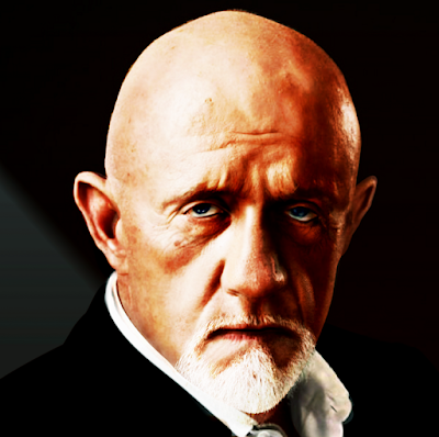
This is the vector portrait of Jonathan Banks who played Mike Ehrmantraut in 'Breaking Bad'. The portrait was created in Affinity Designer in which I still am experimenting because I continue to discover different ways to create certain effects. In this particular work I often used the clipping of strokes, (custom made) brushes and objects (shapes). I used Gaussian blur a lot on both the clipping objects as the clipped objects, which can go several levels deep without a problem. ALL objects are given the parameter: scale with object, so that the image can in theory be re-scaled to any size without loss of quality.


February 18 2022 - Stage 20 - 20 hours


Some details, like the eyes, are intentionally drawn differently from what they look like in the reference image to enhance the visual impact of the image without giving up likeness. In every portrait the eyes determine 'the look' of the artwork. The choice of more or less differing colours can also be used to create a more dramatic effect. These are among my most used tricks to draw portraits that are more than just accurate copies of photographs. I prefer to create some sort of visual metaphor that reflects the way I perceive characters in an attempt to highlight the essence of their personality by revealing what (I think that) hides behind which is obviously noticeable at first glance, because everyone wears a mask, a fact of which some are not even aware that they do. I like to suggest to the observer to look beyond without encouraging to dissect in an invasive way, because when observing becomes judging one can no longer enjoy art. 

Custom designed vector Brushes can be used as textured shapes in various ways that I may explain in a video tutorial when I have enough money to by a decent cam and get the hang of video editing software. It is a very interesting option for artists that use a lot of organic texture in their artwork, but it is not an obvious thing to do. Affinity Designer is able to handle the unusual array of functions applied quite well; it doesn't crash. This currently (May 09 2020) is a work in progress. It is still far from perfect, but I learned a lot. Again (seems to be a never ending process). The various stages of development you see below - the oldest stage at the bottom, the newest one on top. At the bottom of this page is the vector outline view of stage 13 for the vector initiates. Click on one of the images to enter Google's Lightbox that allows to quickly scroll through the images with the mouse wheel (for those viewing this page on a PC anyway).


Mike Ehrmantraut - 'Breaking Bad'

May 19 2020 - stage 19 - 19 hours


Vector portrait of Jonathan Banks

May 09 2020 - Stage 15 13 - 14 hours of work


May 08 2020 - 13th stage - 11-12 hours so far


Stage 19 vector outline view


April 22, 2020

Re-created my VectorWhiz website

I re-crated my website - https://vectorwhiz.com - because the previous one, built with Pinegrow all of a sudden mysteriously became corrupt. It was beyond my skill to fix it. I rebuilt it with Mobirise, since Pinegrow would not allow me to re-install the version that I bought a few years back (in which I had lost trust anyway) and Bootstrap Studio still requires too much coding. This may be a good thing for hardcore coders, but not for me. So Mobirise was probably the only option left to get back on-line within a reasonable amount of time. The site needed some changes, so this was as good an opportunity as any to do it.


VectorWhiz logo


The site logo, by the way, is based on Marko Rodin's vortex math, that I believe to be related to (beneficial) ancient occult knowledge that has a more intimate bond to the real reality than what it is commonly believed to have. In a kind of cynical way this personal perception is circumstantially substantiated by the fact that Rodin's site has disappeared from the web. Making true information go away is one of the specialties of the powers that be that are interested in carrying out their concealed agenda, not in the truth. Obviously I do not share that point of view, since it is based on values without value, i.e. on a system that demands submission and obedience to a totally corrupt entity.

I've always clung to the principle that disobeying the insane is never illegal, which I also try to reflect in (most of) my art, even if not in an obvious way. This is for instance done by assigning values to drawing functions that either comply with vortex math principles or the numbers preferred (for good reason) by Nikola Tesla. So, the magic goes into the invisible meta data of the images I create and not observable doesn't mean absent. If you're really interested in what this implies, I'm sure that you'll find more information on this subject somewhere on the Internet. To the aware it will be worth their time and effort. Visit my site and have a nice day.


April 6, 2020

Renault Alpine A110 vector drawing

This Renault Alpine is my all time favorite car. Its lines are almost sensual, a caress to the eye, but it is as aggressive as one can get from a small bore block that was placed in the back (not a mid engine). Especially the front is brilliantly designed. The outstanding design was created by the legendary Giovanni Michelotti, who drew many fabulous cars. This image is entirely created in vectors in Affinity Designer. The drawing does not contain a single pixel, it contains vectors only. The texts are still editable, because I tinkered with the Character functions - tilting of individual letters, height, width and spacing between the letters.


A few remarks considering this project:
  • When exporting to a size (a lot) smaller than the dimensions it was drawn in, jagged edges appear in the near horizontal and near vertical edges and lines. When exporting to the native size (in png) and re-scaling afterwards, this problem no longer exists
  • For this particular work exporting in the Bilinear Resampler with the Apple RGB ICC colour profile ticked and palettized deslected works best with the profile embedded. This profile can be saved and used in other projects. The colours are richer and of slightly darker tone than the standard settings in Affinity Designer
  • The most tedious objects to draw were the head light lenses, the radiator grilll, alloy wheels and bonnet hinges. Still Affinity designer allows to adjust these easily and quickly afterwards
  • The Character functions in Affinity Designer allow to create realistic text that is observed from an angle, while the text remains editable. This is a hugely useful feature for projects that contain text that isn't viewed from an angle perpendicular and centered to the text
  • The Gaussian blur function, combined with gradient colouring and transparency, allow to create hyper realistic vector images that require far less time than the mesh-fill function in Illustrator and CorelDRAW (to create the same) and makes adjusting afterwards a much faster process than what is offered by the competition. When re-scaling the image to a larger size it stays sharper than images created with mesh-fill techniques that is basically replacing pixels with vectors, which only takes away jagged edges but does not change the relative pixel density of the image. When using the mesh-fill technique in which a transition is originally drawn in 10 steps, it remains 10 steps no matter what re-scaling is applied, while using the non mesh-fill method of Affinity Designer the transition is simply recalculated with every act of re-scaling, which equals a smooth infinite number of steps, without 10 steps having to coordinate the effect of individual steps
  • The alloy wheels are drawn in Rhinoceros 3D, turned into the proper viewing position and then placed into Affinity Designer to trace and edit. This also applies to the tire groove patterns. In doing so I can design my own wheel and tire patterns, while keeping their appearance realistic and in the correct perspective. Later these objects will be traced manually to keep the drawing all vector, so that it can be re-scaled to any size without loss of quality
  • The size in which this drawing was created is eight times bigger than the exported png's in this post. When printed in approximately 70 x 35 cm the details will appear much better than is visible here
  • The reference image was a poor quality drawing  (the image that is, not the artist's drawing skill) and had mistakes in them, but it was a more dynamic image than any photo I was able to find nevertheless. I needed to look at many different photographs to give the car an authentic appearance. Still I added some detail that make it unique (which is what I always do in every drawing and painting that I create)
  • There may be two versions - one the street version of the car and the other a stickered rally version. The stickers will be on a separate layer so they can be turned on and off at will. I must find the time to do this though
  • I struggled with the left front wheel well, because in the reference image the car has extended bulgy wheel wells, which I dislike, until stage 19 where this was corrected, since this stage the car now has its original subtle wheel well. I came across this problem because there previously wasn't enough space for the lateral blinker and type insignia, that are placed behind the front tire wheel well and flush with the top of it. Now there is. Check out the difference between stage 18 and 19 by clicking on the stage 19 image and flicking between the two stages in Google's Lightbox


It is still a work in progress at this time (I started this project on April 3 2020). The oldest stage is at the bottom, the newest on top. Click an image to go to the Google Lightbox that allows to swiftly flick through the stages by turning the scroll wheel of the mouse. Unfortunately this works in desktop computers only.


Stage 19 15:19 hrs, April 17 2020


Stage 18 11:42 hrs, April 14 2020


Stage 17 13:24 hrs, April 10 2020


Stage 16 23:00 hrs, April 9 2020


Stage 15 23:00 hrs, April 8 2020


Stage 12 12:50 hrs, April 6 2020


Stage 8 23:00 hrs, April 5 2020


Stage 4 13:00 hrs, April 4 2020


Stage 1 14:30 hrs, April 3 2020


===========================================


Outline view, 3D parts and reference image


Stage 18 vector outline view -
Alloy wheels and tires must still be traced
The wriggly red lines below the editable texts
indicate the entries (Vectorwhiz and Cibie)
are not present in the dictionary
while Renault actually is


Alloy wheel drawn in Rhino 3D
seen from a different angle


Tire drawn in Rhino 3D
seen from a different angle


Reference image


March 19, 2020

Realistic vector portrait of a beautiful woman

After having mostly created logos lately, I finally got to doing what I love most - making vector portraits. In the magnificent Affinity Designer of course that is way ahead of its competition where creating organic images is concerned. Its Gaussian blurring of vector shapes is unsurpassed and the custom gradient colouring and applying of transparency are unmatched, allowing artists to have almost complete control over creating subtle transitions. Illustrator and CorelDRAW don't even come near and I've worked with those programs for decades both professionally and privately. Only the fantastic open source program Inkscape is capable of doing the same, but its UI is still somewhat enigmatic, although its developers have made a lot of improvements in that field recently.

Below you see the progress sequence. The oldest stage at the bottom and the newer ones above that. This currently is a work in progress and I have only began drawing today (March 2020). I am trying out a new style (for me at least) and use techniques that I haven't used in creating vector portraits that I made before. I plan to make tutorials, but have only recently started fiddling with the video editor Olive. I hope to find the time to familiarize myself with this program and compile a tutorial about how to create a realistic vector portrait in Affinity Designer. I've written about this in previous blog posts, but I will present a short recap here of why Affinity Designer is better than Illustrator and CorelDRAW for making realistic vector portraits.

Realistic vector programs can be made in those programs, but only when using mesh-fills, which is a horrendously tedious business. The Affinity Designer functions I mentioned in the first paragraph allow to create realistic portraits AND allow to quickly tinker details afterwards, which is something the competition is unable to do. Creating realistic vector portraits is all about tweaking, so you've come to the right program with Affinity Designer. This is a huge time saver and it prevents headaches. Check regularly to see the progress I will make with this portrait after this day. By the way, the reference image was a rather average photo of the stunningly beautiful artist Monique Klemann who sings in the duo Lois Lane with her (also beautiful) sister Suzanne.

Tip for watching
Click on an image to see it in Google's lightbox. It allows you to flick between stages by using the scroll wheel on your mouse (assuming you're on a PC or Mac). This makes it easy to compare the difference in the stages. Some progress may seem small, but involved much work, which is a characteristic of creating portraits. Tablets and smartphones unfortunately do not allow to scroll in the lightbox.


12th stage March 25 2020


10th stage March 24 2020


9th stage March 22 2020


8th stage March 21 2020


7th stage March 21 2020


6th stage March 20 2020


5th stage March 20 2020


4th stage March 19 2020


3rd update of March 18 2020


2nd update March 18 2020


First stage March 18 2020


Vector outline view of the 12th stage


Notes March 22 2020
The real complexity is in tuning the gradients of each object where it concerns, colour, intensity, direction and positioning. Affinity Designer's approach is however far less tedious and time consuming as Illustrator's and CorelDRAW's that use the mesh-fill technique to create realistic portraits. The portrait on this page so far cost me four days of working on it and off (more off than on actually). Had it been constructed with mesh fills I would have worked on it for a month or longer. The mesh-fill drawing method is translating a cluster of pixels of a similar colour into a vector shape or stroke. This means gradients are all different clusters. Colourful images therefore have an absolutely huge palette. Depending on the subject being drawn, this can require a tremendous amount of drawing. Making changes afterwards as a result also require a shedload time and effort. Due to its available functions Affinity Designer does not force artists to struggle with these particular chores.

The 'new' techniques that I referred to in the second paragraph are textured custom brushes to create and edit irregularly shaped strokes that are too complex to edit with the stroke panel and blurred strokes clipped along the irregularly shaped edge inside an (also blurred) shape to apply a shadow effect. Clipping blurred shapes into other blurred shapes allow to create objects that have a varying level of blurring on their edges, which is quite useful when drawing portraits. It would of course be more clear if I were to demonstrate this is a video clip, but at this point I am still learning to use the video-editor Olive. Once I've mastered that I may create a video tutorial on these techniques.


March 3, 2020

The jaguar & the rose - vector image


I recall once reading a story about an MD who suffered from cancer and was told by his peers that he had less than half a year to live. He consulted several of them and they all expressed the same daunting message. Then he ran into accounts of people that went to the middle and southern Americas to visit shamans and take ayahuasca, some of whom were cured. He began drinking the hallucinatory brew and during his trips he saw jaguars that approached him and smelled him, seemed to think, went away to other spaces and times and returned to do the same again. This happened several times and after these trips the MD lived an other twelve years instead of the six months that his peers predicted he would be allowed to spend in this world. Some would say that this could imply that the jaguars had found a way to cure his ailment. Those that think this story is BS, will never find solutions to any of their problems in such a way.

The MD said it seemed as if the jaguars were thinking on how to help him solve the problem of his illness. They did so when they disappeared into an other dimension after which they came back to him to do more observing. When they were done thinking (and doing whatever was necessary) the MD was granted an extended presence in this dimension. Perhaps to persuade people to have an open mind to alternative healing methods and to other matters not related to curing sickness. He had made his career in official medicine that proved unable to heal him. Only when he decided to revert to methods that were considered to be quackery by the practitioners of the 'official' medical trade did he regain his health. Real progress requires a zeal to disembark previously cherished trains of thought and change over to different means of travel that may lead to different destinies in different dimensions, timelines and universes. Setting goals is therefore very difficult. It is the result of the imposed limitation of this dimension.


The core of this graphical design
Visit my website to see more of my art


I thought of this MD's adventure when making this drawing years ago. But it was not until recently that I recreated the image in vectors. Affinity Designer made this possible, because it allows to blur vector shapes, which is a crucial part of the techniques used to draw the jaguar and the rose (alongside a bunch of other functions that made drawing this image possible). I added the flower because its symbol has a mythical status in esoteric factions and a few other references to supra human powers, performed by humans nonetheless, who have been initiated to uncommon knowledge. Their number is however extremely small.

The jaguar's paws are shrouded in fog that suggest a presence in a mystic environment. Behind the big cat is an orange sphere of light from which rays emanate, which symbolizes a portal to elsewhere in space time from which the jaguar entered this material realm. The fact that the jaguars in the vision of the MD no longer have to take lives to survive, but rather give live to a dying man, means that they have progressed to a higher dimension in which the more elaborate act of creating is favoured over the far easier act of destroying.

I started to create this image in black and white and switched to full colour at a later stage. Stages older than the one shown that is visible at the bottom, are not interesting. The newer ones are placed above that and the most recent stage can be seen at the top. It's quite likely that I will continue to tinker this image some more at a later date. The time of writing is March 3 2020. Click on one of the images to see them in Google's lightbox that allows to scroll between the various stages effortlessly by turning the scroll wheel of the mouse. Unfortunately this function to my knowledge is available on desktop PC's only (as far as I know).


The latest stage (for the time being at least)


This is outline view in which vector lines and shapes are visible


The switch to colour


Older stages were made predominantly in B&W
What was drawn before this stage is less interesting


February 17, 2020

Elvis Presley graphic vector poster


I haven't been able to post for a while, but here finally is a new work. It is a 100% vector graphical portrait of Elvis Presley that will be used to create posters and T-shirt prints. This type of drawing is far easier to make and less time consuming than the photo-realistic vector portraits I have been creating so far. I started to draw a simple vector portrait that looks like this:


Graphic style vector portrait of Elvis Presley


Then I created the type in Affinity Photo, because it has a distortion tool that allows to manipulate text into geometric shapes. These pixel shapes I manually traced in Affinity Designer and placed the portrait of Elvis in the same document, which resulted in this image:


Poster / T-shirt design


The portrait was drawn in a few hours, the text took a bit longer. I am still honing my skills in this type of work and from experience I know it will get better within a short period of time. Once I am satisfied with my progress I will post the results and place the designs in my T-shirt shop. Look for this shirt here, which would look like this:


Elvis T-shirt


The shop allows you to personalize the size and positioning of the image, choose the colour of the T-shirt (although I think black is the best option for this design).


January 4, 2020

Crest of Amsterdam created in Affinity Designer

This blog entry shows the Crest of Amsterdam created in Affinity Designer, so it is all vector, no pixels at all. The image shows three Andreas crosses at the center of the crest. They were used allegedly as a reference to the apostle Andreas who was tortured to death on such type of cross. Other than that the origins of the objects and shapes used are unknown. There also is an unproven link to the bankers of Florence - predominantly the De Medici family - that were supposed to have taken their business to Amsterdam, Copenhagen and London after their competition - the Bardi family - financed Columbus who returned with literally shiploads of gold. The agents of De Medici purportedly put different accents in their banking policies, which delivered them riches beyond imagination. The Andreas crosses that resemble the letter 'X' are also believed to have maintained their meaning of secrecy throughout the ages, that even today are used by organizations that run classified projects far outside the view of the general public and are even kept away from the commonly better informed factions of society.


Most recent coloured version


This is what the coloured crest looks like on T-shirt
It is available here


Before the version emerged that is shown above, I made an outline version that you see below:


The outline version of the crest


This is what the outline version looks like on T-shirt
For those who like it, they can obtain it here


Finally, below you see the vector outline drawing of the crest. From this designers may be able to conclude that the real complexity of the colour design lies within the creation of gradients and effects that Affinity Designer offers abundantly.


Tip: If you click on one of the images you will be lead to Google's Lightbox which shows larger versions of the images against a dark background, which is a lot more pleasing to the eyes.


December 10, 2019

Range Rover Evoque - vector drawing


I was blown away when first seeing the Range Rover Evoque. Its design is stunning. Perfect in every detail. The designer obviously is brilliant and the fact that the car turned out so beautiful is probably the result of the marketing department not getting in the way. These blokes often are responsible for ruining designs that are a caress to the eye, because they want to please as many (potential clients) as possible. But with a designer capable of creating such a mind-blowing car, Land Rover did well to keep its marketeers on a short leash.


Stage 20 - Dec 11 2019 - 22:11 CET
with transparent background


The drawing in wire-frame view looks quite simple; the bulk of the work is to get the gradient colours right and the gradient transparency. They could of course be eye-dropped from the reference photo, but like in my portraits of humans, I like to put more drama in the images I create by altering details in which colours are very important. Another 'problem' in Affinity Designer is to get gradient shadows and reflections right, i.e. when gradients extend in more than one direction. I usually duplicate such an object and change the colours and gradient direction of the duplicated layer (and / or consecutive layers). The unwanted parts I 'remove' by applying custom transparency or by altering the shape of the object (adding or subtracting parts of the object area). B.t.w. all objects are given a Gaussian blur to make the image more realistic. Objects drawn in CorelDRAW or Illustrator often look unrealistic, because of (the object's) hard edges. Artists won't have this problem in affinity Designer.

Drawing such a subject results in many layers. Each object is a separate layer that I gave a specific name in order to make finding a particular object in the layers panel less of a hassle. I lock the reference image on top of all layers and make it transparent, so that I can always choose to see the reference or not while not interfering with other layers. Mind you, you can make the semi transparent reference layer visible, while still being able to draw on a selected layer below it, which is brilliant. I also use the outline view a lot which I gave a custom shortcut to make it possible to quickly switch between normal view and outline view. When having created a bundle of objects it is often quite useful to select the object in outline view (wire-frame view).

A feature not yet included in Affinity Designer is the feather function which would have been quite helpful (and time saving) in creating this image. But I saw Serif put it on the road map of future functions to be added. Although I'm not overly enthusiastic about mesh-fill function (like in CorelDRAW and Illustrator), it may have been useful at some points during the drawing of this car, but again, I saw this on Designer's road map of future functions. Other than that, Affinity Designer allows me to do things very quickly and precisely that I was not able to do equally fast or precise in the programs of the aforementioned competition, which becomes clear in particular in the vector portraits that you find elsewhere on this blog.

I just had to make a drawing of this eye caressing creation. It is a 100% vector drawing made in Affinity Designer. I bundled the first 12 stages in one image to get past the boring level and placed some later stages above that. Click on one of the images to see the stages in Google's Lightbox in which you can scroll through the stages swiftly by turning the scroll wheel of the mouse (on a PC anyway). Oldest stage at the bottom, newer ones above that. I've also made a short clip of this sequence that you find here.


Stage 20 - Dec 11 2019 - 22:11 CET


Stage 19 - Dec 11 2019 - 14:23 CET


Stage 18 - Dec 10 2019 - 19:06 CET


Outline view of stage 18


Stage 16 Dec 9 2019


First 12 stages


Here is an experiment with the video editor 'Olive', my very first try, so bear with me. You may want to take a peek at this video in full screen mode.