October 23, 2022

Exploring VectorStyler - Part II


Introduction
After losing the files I saved on a network drive in VectorStyler, as stated in the previous blog entry, I decided to save them on the system drive, which in itself worked well. The problem is that my computer is too old and lacks the power to properly create advanced graphics - realistic vector portraits - as I found out this time with exporting the various stages of development in the png-file format. My old rig has a first gen i7 Intel CPU from 2008 (....), has dead slow 16 GB 1333 MHz RAM memory and an extinct NVidia GeForce 750 Ti, which in today's world probably is considered to be a prehistoric system. I am therefore considering to upgrade to the Minisforum Neptune HX90G with an AMD Ryzen 9 5900HX CPU, 64 GB RAM memory and a M2 512 GB SSD, that has a dedicated GPU - the Radion RX 6650M, while taking up very little space (2.8 liter case). I prefer this x486 AMD mini PC over its Mac competition, because it offers the right to repair and upgradability, plus the fact that the software I purchased, is written for the Windows platform.

The reason that I continue to experiment in this constantly updated, ongoing blog entry with VectorStyler in spite of the problems I encounter with running the program properly, is that it has an absolutely huge potential and many of its incorporated functions already work excellently, while some still require a bit of tweaking. Its developer - a single person, named Csaba Ráduly Baka has so far done a most outstanding job creating and developing the project, in a way that made me convinced of the fact that at some point the bugs will be written out of the code and even more new features will be added. So, this series of blogposts is an on-the-fly test / review / in depth exploration that will last as long as VectorStyler will continue to be developed into a mature state, even when I may encounter additional obstacles.


Export Problem & portrait stage sequence
Because I was unable to export the vector portrait in png-format properly, I made screendumps so that I can still place the progress sequence of the various stages of development in this blog entry. The most recent one is at the top and the oldest one is at the bottom. Where necessary I will enter a comment below the screendumps in addition to the image captions. One crucial aspect of my drawing technique is that I place the reference image on top of all other objects and make it transparent, so that it is easy to retrieve whenever necessary, while its transparency can be changed whenever I temporarily need a more clear image. This is useful especially when a drawing contains hundreds or even thousands of (clipped: objects inside of other objects) objects. From what I have seen in tutorials on Youtube, most artists place the reference image or photo below all others, but for me this does not work for the reason mentioned here.

When the portrait is completed, I will post the vstyler-file in the VS forum, for fellow users to inspect. Note: all photos of Maria Orsic on the Internet are a kind of grainy and jagged black & white type of images, that probably do not do her beauty justice, but I do my utmost to make the best of it. The lack of quality in the photos implies that I was forced to interpret aspects of her face in order to be able to create a portrait that includes the attributes of a realistic depiction of a person. In addition I permitted myself the liberty to lean towards a personal elucidation of miss Orsic' stunning appearance, that also is known as 'artistic freedom', which is a style signature that is present in all the portraits I create.


Tools used in VectorStyler
An other thing is that I did not draw this portrait using the Mesh Gradient tool, which I feel is tedious and time consuming to work with, but I drew separate objects (most of which are clipped several layers deep and blurred, that I named accurately in the Layers panel so that I can find them back at a later point in time for further editing. Also, all objects that are drawn are vectors that will rescale and remain sharp in every size into which the image is rescaled, while the mesh tool is a simulation of pixels in vector format that requires a great amount of calculation when rescaling the image. For instance: many of the shadows consist of a single line with 2 (or in some cases a few more) nodes that probably require less computing power when the image is being rescaled. Editing objects at a later point in time, I find easier also when they are separate objects, each of which can be tuned to what it needs to be, which is especially useful when balancing shapes and colours when an image is in the final stages of the design process.


Brief tutorial on creating objects with varying blur levels
I uploaded a brief tutorial on the VectorStyler forum on how to create objects that have areas of varying blur level ratios along their circumference, that is a technique I often use in drawing realistic vector portraits. The usual type of vector portraits created in Adobe Illustrator almost always have hard edged areas (shadows, creases, hair, facial parts like eyes, ears, nostrils, eyebrows etc.) that make them unrealistic, even though they are presented as realistic vector portraits. Adobe's marketing department has managed to successfully sell Illustrator's shortcomings as a feature and, as commonly is the case, the ignorant majority of the market fell for the carefully concocted scam. An example of such an awful portrait you find here. No offence, but I don't think these portraits qualify as realistic, nor do they deserve to be the maistream standard in that conjured category. But as long as most people prefer to think with their spinal cord, such basically ridiculous type of 'artwork' will be considered to be 'great' by those that have no clue of what greatness is. I have been creating realistic vector portraits for years now and examples of what I mean by that can be found in my website; those portraits hardly have any hard edges, which is exactly what does make them realistic. The process described in this blog entry is the first realistic vector portrait that I drew in VectorStyler - the ones on my website were created in Affinity Designer. I am seriously considering switching from the latter program to the former one mentioned in the previous sentence, which is why I am creating the portrait shown below as a test.


Added the darker areas in the hair and began drawing the left ear

In spite of the calculation / rendering problems my computer presents me, I decided to do a little more drawing. The old machine causes the program to freeze often and say that it is not responding (which lasts up to several minutes at best), but I was dissatisfied with the appearance of the previous stage. In this 12th stint I drew some darker accent areas in the hair, so that at least there is a hint into which direction I am taking this 100% vector portrait. Also corrected the lower eyelid of the right eye. I still need to tweak the colours, intensity, gradients in these areas and add more detail, but I'm afraid that would be challenging this archaic device beyond its limits. After the Minisforum mini PC has arrived and has been set up, I will continue to explore the superb Vectorstyler by way of this project.


Added some more shadows and drew the hair base

At this point the program on this very old computer is behaving very strange, which probably is the result of a dramatic lack of computing power, even when all other programs were closed. I ordered a new computer as described above and will continue when that one has arrived. The hair was done according to the technique I described in the seventh stage. It allowed me to draw a gradual transition area between the hair and forehead. The accents in the hair could not be rendered, which confirmed my suspicion that my machine simply was unable to handle the computations.


Tinkering with shadows on the face

Applying subtle shadows on a face, probably is one of the challenges of creating portraits. If a shadow is off just a minute amount in colour, intensity or blur ratio, there is a risk that entire portrait goes down the drain. So, this took me longer than I expected and I still am far from done. I discovered that in the gradient colour tool each node can separately be given a colour but also an opacity level. Nodes can be added by clicking on the gradient indicator line and typing '+', they can be removed from it by simply dragging the node off the line. Very intuitive. The easy way to draw subtle accents probably is to clip one area into an other (several layers of clipping) which also works well and is easier to control. I will try that in the next stage. In the previous stage I wrote that I wished the blur ratio had a bigger range until I discovered that the interactive tool includes nodes on the top and bottom of the reference circle to adjust the range, which is virtually without limit, unfortunately only in one direction. The developer Csaba Ráduly Baka must have advanced artistic skills besides being a brilliant programmer, because these functional details would never have been considered for implementation by a brilliant programmer who has no artistic skills or too little of them.


Added base shadow on mid and left site of the face

This is the seventh stage already. Edited the mouth somewhat. Tweaking the big shadow until I became senseless - with the blur ratio tool (which I wished would have a more extended range), opacity and gradient colours with a proper number of nodes. Probably some clipping of additional objects will be necessary to get things right. I uploaded a tutorial on how to create objects with a varying level of blurriness along their edge in the VectoStyler forum. Had I been more proficient with gradient colour editing (which is present in VectorStyler) I would probably have used it, but to be honest I dislike that tool from my experience with it in other drawing vector programs. I do like the mesh gradient transparency tool, but I still need to  practice it more in order to efficiently use it. I have to leave the image alone for a while and return to it at a later point in time. I'm sure artists are familiar to this type of situation in which the proper settings just elude them, while that seems to be no problem further into the future (I hope). Part of this problem is caused by the fact that I drew the shadow in one piece, in order to minimize the number of objects, which does not always work...... Also, my ancient rig is beginning to struggle, so purchasing a new, more powerful one kind of climbed on my bucket list. First I have to check the budget though, since being able to buy food is important.


Experimenting with dark background

Editing colour intensity of the blurred shadow area at the right side of face mainly to see how that would appear against a dark background. Most of my vector portraits have a transparent background so that I can place them before any type of background and change my mind whenever it seems appropriate to do. Colour balancing therefore is important.


Added mouth and chin line

Besides working on the mouth and chin area and correcting mistakes in the eyes area, I have begun experimenting with mesh transparency, which is an absolutely brilliant function that is present in none of the programs competing with VectorStyler. I will need this function at a later point in this design, but I don't feel familiar enough with it to apply it already. It is just one of the many functions offered by VectorStyler that devs of its competition have not figured out yet how to code. Still a heap to learn for me!


Added shadow to the right side of nose

While tweaking the left eye VectorStyler froze and offered a weird message without saying what was wrong. After closing the program and restarting it, I was offered the option to retrieve a back up, which worked just fine. Immediately the developer responded on the forum and reported a bug. This type of swift support I have never experienced anywhere in my long involvement with software. Great!


Added shadow on the right side of face

Besides adding the shadow on the face' right side did some tweaking of the right eye. Shadowing requires a subtle approach, both in intensity, giving objects a blur ratio and applying colour accents. There still are details that bug me, but I am sure that I will get them sorted out at some point, as I become more familiar with VectorStyler.


Added right eye

Copied left eye to the right. Reshaped elements with the move- and node tool. Adjusted colour accents and lighting, mainly in clipped objects. Renamed copied left eye objects to right eye parts in Layers panel, this because there already are many objects in the drawing that I need to retrieve at a later point in time for further editing, when looking to rebalance colour intensity, because in portraiture moving and reshaping (parts of) objects just a few pixels determines the quality of the likeness, as do do colour accents.


Added shadow behind the left eye

So far, I have mainly been using the Gaussian blur function, object clipping and interactive transparency, all of which work superbly. Many image effect functions - such as blurring - can interactively be fine tuned on the spot, which offers artists the option to exactly and instantly see the result of their tweaking.
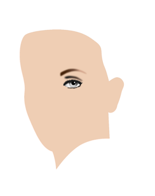


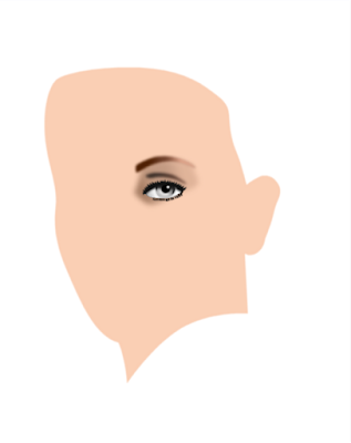
Started drawing the face contour and left eye

When drawing realistic vector portraits, I always start with the eyes, because they are the dominant factor in facial features. For drawing I use the pen tool and the node tool to fine tune. Most objects are given a Gaussian blur effect. Colour management in VectorStyler is very easy to use with great precision.


Stage 15 - vector outline


October 17, 2022

Einstein analog / digital portrait


This is a proverbial combined freehand airbrush / Affinity Photo portrait of One Stone a.k.a. as Einstein, the relativity bloke. The man that urged Roosevelt to develop nuclear arms, that the US used to bomb Japan (twice) when the outcome of WW-II was already decided. In a long lost past I used to take up the airbrush gun and spray paint on different kinds of surfaces. With one or two exceptions always worked freehand, i.e. without any masking. 

Today, I work in the digital realm mostly, because it is convenient, less of a hassle and - most importantly - corrections are relatively easy to make in less time than is the case with an analog airbrush. I do sometimes however pick up the trusted Iwata or Harder & Steenbeck airbrushes to get my mind off things I need the time to process in a proper way; the old way of airbrushing works better to do such a thing than the digital stuff.

I used the Iwata HP-BH airbrush to spray the Inspire H2O paint on an old piece of paper that I had laying around. Very low air pressure, thinly diluted paint and Chillhop music to drift away, but not too far to be unable to do anything useful. To be honest, I like the HP-BH more than the Custom Micron, probably because I like different things better than what commonly is considered to be the best of the best. I was forced to buy the HP-BH on an airbrush show, after one of the visitors had stolen my Paasche V1 - which was the best tool ever - when I took a break and left the V1 unattended on the easel.

I dropped the HP-BH on the floor and because I never use the back cover of airbrushes, the needle was driven into the nozzle quite hard. I had to get it out using a pliers, because it was firmly stuck. However, the HP-BH kept on spraying like it never happened and I used the same needle and nozzle for years after the incident without any problem. I would not recommend hammering the needle into the nozzle before use, but I became convinced of the high quality of Iwata airbrushes.

Being a senior geezer, when finding an old airbrush painting, I see mistakes I made and correct them in Affinity Photo - a digital photo editing program, that resembles Photoshop, but is much much cheaper and equally as good or better. Check out my pixel paintings and vector portraits in my VectorWhiz website that you find here. Most recent stage at the top, older ones in chronological order, below it.


Digitally edited in Affinity Photo


On my DIY vertical light table


Analog airbrushed with Iwata HP-BH


Analog airbrushed with Iwata HP-BH


Early stage


October 10, 2022

VectorStyler - vector drawing program


By accident I came across a new vector drawing program called VectorStyler. Someone mentioned it in a Facebook group and I decided to give this program a try. What I saw was close to mind boggling; the functionality of this program takes the cake out of its competition. It still is a beta, so it contains bugs, but if its developer succeeds in repairing them, there is nothing in the market that has as many functions, not even the well established market leaders and promising runner up programs. Not by far, I may add - it is chockful of tools and functions, some of which are unique (but quite useful) to the community of vector drawing artists. Vector-Styler has all the functions its competition combined has and then some.....


Vector image created out of
enthusiasm over VectorStyler


It is available for Intel Macs, M1 Macs and Windows. VectorStyler is developed by a one man team (!!!), someone named Csaba Raduly-Baka who resides in Finland. When peeking into his other (high level advanced and complex) activities it is difficult to imagine where he finds the time to combine all his activities.... The overwhelming measure of functions that the program offers, obviously results in a necessarily extensive user interface, so figuring out how things work, requires time to get familiar with them for users who come from other programs. But like I wrote: If the developer tweaks the code to function properly, it will most definitely be worth to struggle your way through the learning stages and wait until the bugs are corrected. Currently - March 2021 - he is asking for feedback (not money) from his users to fix bugs in the program code. Visit the VectorStyler Forum to post bugs or make comments. The developer is very responsive, which also shows in the large number of bug fixes in the various beta versions that succeed each other rapidly. This is a project most certainly well worth your attention and support.

I'm new to this program myself, so I still have to explore what it can or can not do (the latter part of the sentence I added for linguistic completeness rather than hinting at a lack of functionality). To get an idea of what it is capable of, check out their homepage (scroll down the page somewhat) and the detailed feature list in the second link above. It still is free while in beta-stage, so go download it and give it a try. I am sure you will be thoroughly amazed and that the competition may turn pale from anxiety and possibly start crapping their panties resulting from that. The program is said to cost a one time fee of just 99 USD when it comes out of the beta stage, which is quite a reasonable price in view of its stunning functionality.

I currently use Affinity Designer to create vector art, that has an easy to grasp user interface, but by far not as many functions as VectorStyler. Like all other vector drawing programs I have used in the past. I have worked with Illustrator professionally for decades, while working with CorelDRAW privately and with Inkscape occasionally, but I must say that none of these match VectorStyler in the functionality department. That is a stunning accomplishment for the single person development of VectorStyler. I will therefore keep a close watch on how the program evolves and keep you updated as I familiarize myself with it. You may even find some artwork resulting from this process in this blog. Stay tuned.


Update October 10 2022

I now began testing this program, in a more intense way than before, familiarizing myself with the UI and tool functions. Since VectorStyler is densely packed with functions, unavoidably the UI is complex. Not more complicated than Illustrator's interface, while offering a lot more features, but I had to find my way around in it. So, figuring out how to apply image effects was an adventure, that I figured out after some trial and error. What drives me to survive the steep learning curve, is that I truly believe that once the bugs are written out of the code and perhaps the UI is a bit more streamlined, this program will become the first choice of many artists. Some features that I already encountered in this first serious venture are:

  1. VS has real vector brushes, not the bitmap ones that are presented to be vector as in Affinity Designer, which keeps images crisp when increasing their scale
  2. VS has many warp (distortion) functions (including mesh warp), many more than any of its competitors, including a liquify tool that is applicable to vector objects
  3. VS has a ridiculously easy to use shape builder tool
  4. VS has a knife tool and a vector erase tool, that works exactly the same as the eraser in photo editing programs
  5. VS has a configurable object blend tool
  6. In VS users can create vector tiling patterns
  7. VS can import, edit and export genuine AI-files, maintaining their object layer structure
  8. VS has a stunningly huge number of image effects that can be fine tuned in the related panel, offers a visual way to edit the effects, can combine multiple effects and can show / hide, reset and remove effects at a later time, which makes the program parametric to a great extent and non-destructive up to quite an elevated level
  9. The VS community is responsive and helpful and the developer fixes bug quite swiftly, while adding new functionality
  10. VS objects can be copied and pasted into Affinity Designer and Adobe Illustrator where they can flawlessly be edited as if they were native objects. Copy& Paste objects from its competitors does not always go without flaws, especially if they contain bitmap elements
  11. VS has an object collision tool (....)


Text warping in VectorStyler


The above text was warped in VectorStyler. One of the brilliant tools in the program is this object warping tool, that can of course also be applied to text. It is possible to do this in Affinity Designer, the program I use most often these days, but it takes at least 10 times more time. CorelDRAW has an envelope distortion tool that sometimes produces strange results. Adobe Illustrator can warp objects as well, but it has to be controlled from within separate panels, which is slower and less intuitive. In addition, VectorStyler has a slew of different tools to warp and deform objects, so basically it is possible to create any type of shape one could think of, including intricate deformations in an interactive way. Simply brilliant.

I am sure there are many more things worth mentioning, that I have not yet encountered, but like I wrote, this is my first dive into the depths of VectorStyler's functions and tools. There are still bugs, some of which make the program instable, but its potential is so huge, that I will keep trying to become more familiar with how to use it, particularly because of the excellent support department. Note I changed the date of this blog entry to October 10 2022, to allow visitors to become informed about the progress of this mind blowing program. If curious, go visit their website to download the trial version, that is free for 42 days, which is a generous offer that you won't find anywhere else. The insanely costly monthly subscription Adobe for instance, offers a 7 day trial for its suite programs. Over time you may find more updates of this blog entry, as I progress in learning how to use VectorStyler properly, so stay tuned.

A very useful resource on how to use VectorStyler is the Youtube channel of artist Fred Lespine. On Vimeo there are many tutorials on how to use the different tools / functions. On VectorStyler's own website, having a peek at 'Discovering VectorStyler', will offer useful tips for those who are new to the program. On Ben Designs Youtube channel he explores VectorStyler. On the MacRumors website there is a post about VectorStyler and the comments to it by users who discovered program functions and tried out how to use them.


October 6, 2022

Mark Twain T-shirt design cartoon


Mark Twain is one of the best know and most read novel writers who graced this world with his preseance and works. Years ago I painted a portrait of the man in pixels from scratch in Affinity Photo, which is the Serif company's equivalent (and I mean this quite literally) of Adobe's Photoshop, but at a low one time fee, so artists aren't bound to a hugely expensive subscription model. Even though Photo still misses some minor functions compared to the industry standard, while on the other hand having some that exceed it, Photo is a most excellent alternative for artists that hate being forced to pay a high amount of money every month to purchase the 'alleged privilege' to use it.

But Serif has also created a magnifient alternative for Adobe Illustrator, a vector program that - like Photo - misses a number of functions, that it amply compensates with different functions that are not included in Illustrator. Creating various level of hard / soft edges around an object being the most interesting for artists who dislike the unnatural hard edges many vector programs offer. The type of artist I am referring to, prefers to create more realistic art, in which had edges are mostly absent. This program is named Affinity Designer, my favorite program, since quite often I create realistic portraits in it (the progress sequence of which can be seen in this blog).

While normal people on average use about 3000 different words to communicate, Twain used approximately 8000 words in his books most of the time. Expressing himself with such an extended verbiage allowed him to say and write things that makes people wonder at least and feel mind blown in other cases. Even the most simple and basic things of life he managed to craft into small or impressive literal miracles, simply because no one ever before had the idea to express them in the eloquent way that became his trademark manner of writing.

One such quotes I used to create a cartoonish image of Twain, around which I placed his words. It is an all vector image, created in Affinity Designer of course. Below you see the different phases of the cartoon portrait, including the misinterpretations that were in them before reaching the end result. Google's Lightbox can be accessed to see the various stages, by clicking on an image. On a PC or Mac it is also possible to scroll through the images, using the mouse wheel, which allows to see the changes in the stages more clearly in Lightbox. Newest image on top, the older ones below that.

Years later I found the penultimate image below and thought: this could be done better and I came up with one that is directly beneath this paragraph.


September 19, 2022

Emojis


Here are a few emojis drawn by me in Affinity Designer, so they are all 100% vector. I did not want to make flat images without gradient colours and tried to mimic human facial expressions, of course exaggerating them somewhat. Exaggeration - imagining the extreme aspect of things - often helps to see the possible consequence of seemingly innocent thoughts, developments and policies. The one at the top is a T-shirt design, the rest below it are just plain emojis. In the captions below each emoji are links to alternative versions of the emojis shown here; you might want to take a peek.... 😄


T-shirt design and a
version for evil people


Wink
for other opinions


Devious
for out-of-the-box-thinkers


Grin
have nothing to hide?


LOL
for mainstreamers


Mental
for the annoyed


Erm....
for those who see


August 25, 2022

Nicepage website builder revisited


I started using the Nicepage website builder in around the beginning of October 2021 and after a few weeks wrote a rather enthousiastic blog entry about it. I tried several other applications that allow users to build websites, none of which matched the capability and diversity of Nicepage. Since that time my enthousiasm only increased and during that period of roughly one year Nicepage has issued over 20 updates ( ! ! ! ), that added more functionality still to the program, all of which make sense. Also these updates never came with bugs, so their dev-team is not only prolific, but also very skilled. To get an idea about their productivity, you may want to visit their page that contains Nicepage's update history.


The Nicepage website


I would recommend this program to both beginners and seasoned pros, because building a website with Nicepage requires no coding whatsoever and is capable of what Nicepage calls Web 3.0, which means objects can be placed anywhere on the page without restriction, while it offers total freedom of positioning along the Z-axis as well. A few years ago, this may have seemed to be a dream that was out of reach for website builders, but Nicepage has made all this possible, while building a clear and intuitive UI, that is top of the bill in the industry.

The number of features that the program has, is incredibly large and yet expanding rapidly. The same goes for the continuously growing number of templates they offer their users for free.... Any designer that hasn't at least given this program a try, is depriving him- or herself of fantastic functionality, creative freedom and sheer speed. And by the way, I am not paid to write any of this; it simply is the high level of productivity and creativity that Nicepage makes possible for website builders, that inspired me to compose this blog entry.

Beside website builders the program is also very well suited for prototyping and UI design and, I dare say, it is so diverse and powerfully efficient that these stages can be skipped. It therefore allows to meet deadlines that other programs are incapable of achieving and make design work a lot more pleasing, because Nicepage removes all restraints that programs of its competition have not yet been able to resolve. Website builders can therefore communicate directly with their clients and apply the changes they request, can be implemented instantaniously. This is a big argument for creative non-coders, that has the potential to increase income drastically in considerably less time.

I use Nicepage in combination with Affinity Designer - a cheap, no subscription vector drawing program and Affinity Photo (a Photoshop like bitmap editor), that can also be purchased for a low one time fee. Nicepage offers its various versions for very modest subscription fees, that by far most designer will not consider to be unaffordable. So, if you're fed up with bootstrap grid restrictions for placing objects, coding and unresponsive support departments, you should definitely check out Nicepage, that also offers a free of charge version for individuals. Finally, all upgrades are handled from within the program - users are notified of an update and can do so immediately. It does not get much easier than this.

Finally, I have to write a few words about Nicepage's support, which is unsurpassed. I ran into trouble once or twice, encountering a bug (which is a rare thing, even when the devs add functionality at an incredible speed), but the developer team addressed the issue immediately and one or two days later the problem had been fixed. I have never experienced such fast resolutions with any program that I ever used. Nicepage really makes an effort of supporting their user base with great pace. This should be an encouragement for website developers that serve many clients; once they run into a problem, they will not suffer from it for a long time and will remain able to serve their clients properly and continuously. This is a really good argument to try out the program.


August 5, 2022

Vector portrait of Emma Britten

I originally posted this drawing in 2019, but kept on working on it every now and then (which is what I often do). Many artists are familiar with this method of working, because after 'finishing' a drawing, it is more often than not discovered that the image needs more adjusting and / or additional work. At times this is a repetitively occuring moment, especially with portraits, in which likeness can depend on moving objects 1 or 2 millimeters, changing their size or shape, skewing them or fiddling with their colours. Faces are the most prominent visual characteristic of a person, which is why there is not a photo of your foot in your passport or ID card, but one of your face.

Emma Hardinge Britten was a well known spiritualist who lived from May 2 1823 to October 2 1899. She was a writer, public speaker, musician and opera singer in her younger days to support her family after her father passed away when she was 11 years old. Her spiritual gifts brought her fame and she was frequently consulted by high ranking politicians, corporate leaders and other important people of her day. It is an indication that elevated echelons of society value the spiritual reality that is intentionally kept hidden from common folk.

This portrait is a work in progress and is drawn in Affinity Designer. This program has all the functionality to create realistic vector portraits that can be edited afterwards relatively fast which is a pain to do with mesh-filled vector portraits. And since tinkering is almost a necessity for portrait artists Affinity Designer is their ideal tool to make 100% vector portraits that can be re-scaled to any size without loss of quality. However, this work also contains vector brushes, which are not really vectors - more about this later.


Had to place this here or else the ugly
image below will show up in preview


What makes vector portraits look realistic is that edges of shapes and lines can be blurred in a controlled way. In addition color fadings can be customized in any desired way (using different colours) as well as the transparency of objects (in a linear, radial, elliptical or conical fashion). The combination of these 3 functions allows artists to create works that are visually indistinguishable from pixel portraits, but - as stated before - can be produced in any desired dimension while retaining the original quality.


Ugly Adobe Illustrator attempt (no offence) to
create a realistic vector portrait, b.t.w., this
is caused by Adobe Illustrator's limited
functionality to create realistic art.


Outside of Affinity Designer only the magnificent free open source program Inkscape (which a difficult to learn UI) has similar features, be it that some of them are difficult to find in Inkscape's UI; CorelDRAW and Adobe Illustrator do not have object blur functions, except when converting objects to bitmaps first, and can not be converted back into vectors. These programs are therefore not suited to create realistic vector portraits, other than with the hideously tedious mesh-fill tool. The portraits not made with the mesh fill tool are very unrealitsic looking portraits with hard edges, as is shown in the image above. Adobe's marketing department has tried to turn this into the standard for vector portraits (in which it obviously succeeded) by suggesting that the programs shortcomings are some sort of artistic oddity that they turned into an alleged type of feature. But no matter how one looks at the result, these are not realistic portraits of high quality; they are at best a visual metaphor of realism.


This is the custom vector brush
created to draw realistic strands
of hair. This can be imported in
your collection of brushes and
used for this specific purpose.


This is the custom made brush used
to paint skin pores. Mix dark strokes
and bright strokes combined, the latter
always on top in the layer panel.


Apply 3D and or Bevel / Emboss fx
to the textured brush strokes to
create a realistic skin pore texture
and fiddle with the brush properties
use custom colour and transparency
overlays and underlays, whatever it
takes to approach realism as much
as reasonably possible.


So below you see a realistic vector portrait created in Affinity Designer. Bear in mind that at this point (September 2019) you are looking at the early stages; it will become more realistic as more work is done to the image. Skin pores and detailed strands of hair in particular will be applied. For the hair texture I created a custom brush that allows to create realistic strands, both dark and bright. The oldest stage is at the bottom - more recent stages are placed above that. Click on one of the images and they will be shown in Google's Lightbox, which (on a PC anyway) allows to scroll through the various stages to quickly see and compare the changes. The original size of the portrait in which it was drawn, is 80 x 62 cm, approximately ten times larger than the images submitted to this site.

Mind you - as I found out later - vector brushes in Affinity Designer do NOT create vectors, but are pixels created inside of a vector drawing program, that will remain bitmaps. So when creating realistic art with Affinity Designer, be sure to make large images in order to avoid blurring and jagged edges when using 'vector' brushes, if the intention is to make large prints of the image.


September 20 2019 00:09 virtually in 3D frame


September 20 2019 00:09


September 16 2019 stage 12
vector curves & Brush strokes
outline view (hugely helpful
in the process of drawing)


September 12 2019 11:50


September 11 2019 11:01


September 10 2019 17:20


September 9 2019 20:13


September 9 2019 16:43


September 9 2019 12:20


September 8 2019


September 8 2019


September 8 2019


May 2, 2022

Vector cartoon Mr. Bean


This time a vector cartoon of Mr. Bean, something different from the realistic vector portraits I usually draw. I didn't have to deviate very far from the reality, since his face in real life is already somewhat cartoonish (no offence). Created in the magnificent Affinity Designer - 100% vector, zero pixels. I first drew this image about 2 years ago and recently revisited the image to make some changes. It is what artists often do: walk away from a project to make some changes later, in this case two years, which allowed me to see details that I missed when drawing the initial image.


Rendered view


I refined, tweaked and recoloured a number of areas in the face, in order to add a certain degree of realism to the portrait, while trying not to throw the cartoonish feel out the window. Affinity Designer allows to blur the edges of a curve (object), while gradient colours and transparency are added to it. The programs clipping function allows to draw objects that have various levels of blurriness around their edges, which adds to the realistic atmosphere of a drawing, i.e. not having areas with unrealistic hard edges. I wrote a tutorial on this trick in an other blog post.


Vector outline view


Such a cartoon of a well known person would be perfect to use in a T-shirt design, which of course brings the risk of copyright infringement. I have to see how to deal with this. The circular text around the Bean's is borrowed from one of the quotes of his creator, Rowan Atkinson, who is a fastidious bachelor, that said a thing or two about living alone, that touched up on the heart of this type of life.


Concept T-shirt design, based on one of his quotes


I made a small collage of various cartoons I drew over time and placed it on my website, that contains many variations in style of my artwork. The cartoons below each are drawn in a different style using different techniques.


Part of a cartoon compilation on my website,


I am trying to become familiar with Blender, which is quite a challenge, since its UI is like no other 3D program I have used before. But I guess I have to endure the headaches and frustrations, while attempting to adjust my way of thinking to that of Blender's developer department employees. The program is free, which better relates to the non-existing contents of my bank account.


Psychedelic Bean rendered in virtual 3D frame


Fiddling about wildly with the curve function - placing a heap of nodes on the curve and dragging them to unusual levels, which does surprising things with the colours of an image and sometimes leads to results that are actually worth looking at. The portrait was clipped inside crossing and expanded strokes that I made into wavy lines with the Node tool and then transformed them into curves that can be used to clip other vector objects or pixel images. I wrote a blog entry before on how to do this.